Overview
Wetly app is an online service that provides easy-to-understand and custom wind, wave, and weather reports, forecasts, and statistics for sailors, surfers, divers, and any other water-sport aficionado. Scroll down to find out more about this case study.
PROBLEM STATEMENT
People who regularly engage in water sports need a way to easily access and comprehend complex and relevant weather data because not making a well-informed decision might turn a day on the outdoors into a stressful and frustrating experience.
We will know this to be true if the user takes less than 10 seconds to access the data they need.
POTENTIAL SOLUTION
An app that allows water sports enthusiasts to quickly access accurate and easy-to-understand weather reports. The information will be displayed in real-time in a simple way with clear and beautiful graphics.
The relevant data will be organised intuitively by categories depending on the selected water activity and will be available promptly without distractions.
RESEARCH GOALS
1) To understand users’ behaviours when it comes to the practice of water activities;
2) To determine how likely and how often users might use a forecast online service;
3) To discover the pain points users have while using competitors' online services; and
4) To gather insights on how to provide complex data in an easy-to-understand way.
User research
In order to understand the needs and pain points of potential users, I conducted 4 research interviews and an online survey with 20 participants. After analysing all the data collected, I was able to create an affinity map organising my findings that I could translate into valuable insights.
USER NEEDS
Findings
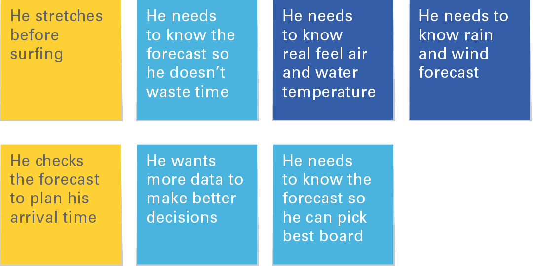
Surfers rely on wave forecast to decide which board to use.
Surfers rely on the forecast to decide the best arrival time.
Divers need to know real feel air temperature to dress accordingly for the boat trip to open waters.
Insights
Suggest user the best board depending on wave height, the best time of arrival depending on tides or appropriate clothing to wear depending on real feel temperature.
Suggest basic stretching or preparation techniques for their activities.
USABILITY
Findings
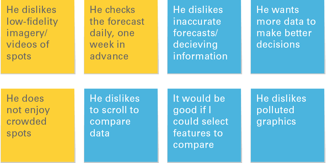
Users want accurate and easy-to-understand information.
Users want to choose what to see and not scroll.
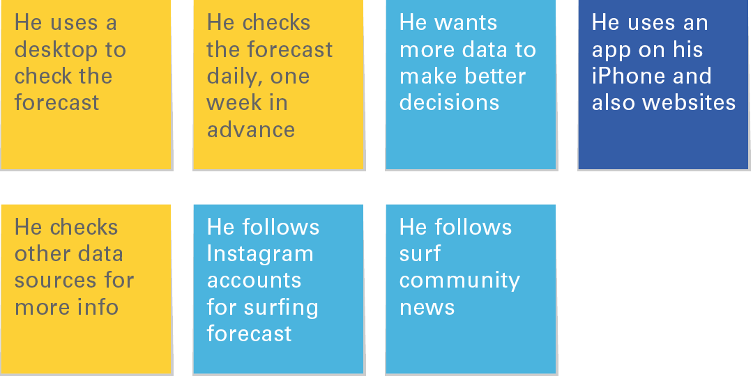
Users check the forecast regularly days a few days in advance.
Insights
Upload only high-quality imagery and provide high definition webcam streaming.
Favour short-range but accurate information rather than a long-range inaccurate forecast.
Provide the option to rate spots by popularity.
Offer the possibility to arrange information based on preference.
SOURCING INFO
Findings
Users rely on more than one source of information using different devices.
Insights
Offer the option to connect with social media accounts.
Provide enough information to win users the confidence to rely on one source.
PASSION FOR THE SPORT
Findings
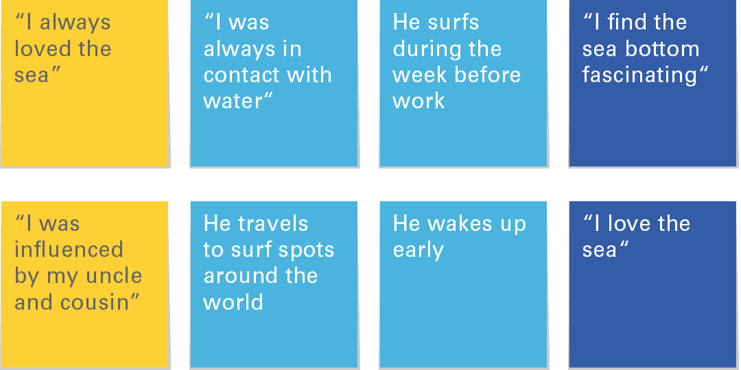
Users demonstrated passion for the sport.
Users are influenced by people and how convenient it is for them to practice their hobby.
Users are willing to change their routine to enjoy the best spot and time to practice their favourite activity.
Insights
Offer complementary information about the history of the sport, i.e., fun facts and curiosities about the activity.
Offer the option to share special moments and adventures.
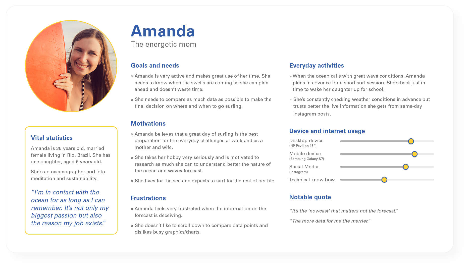
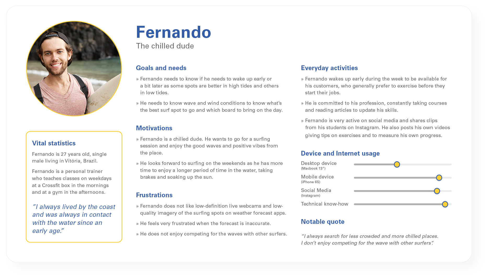
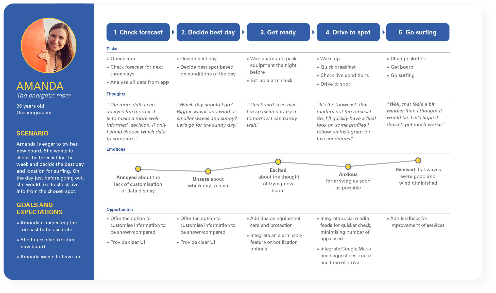
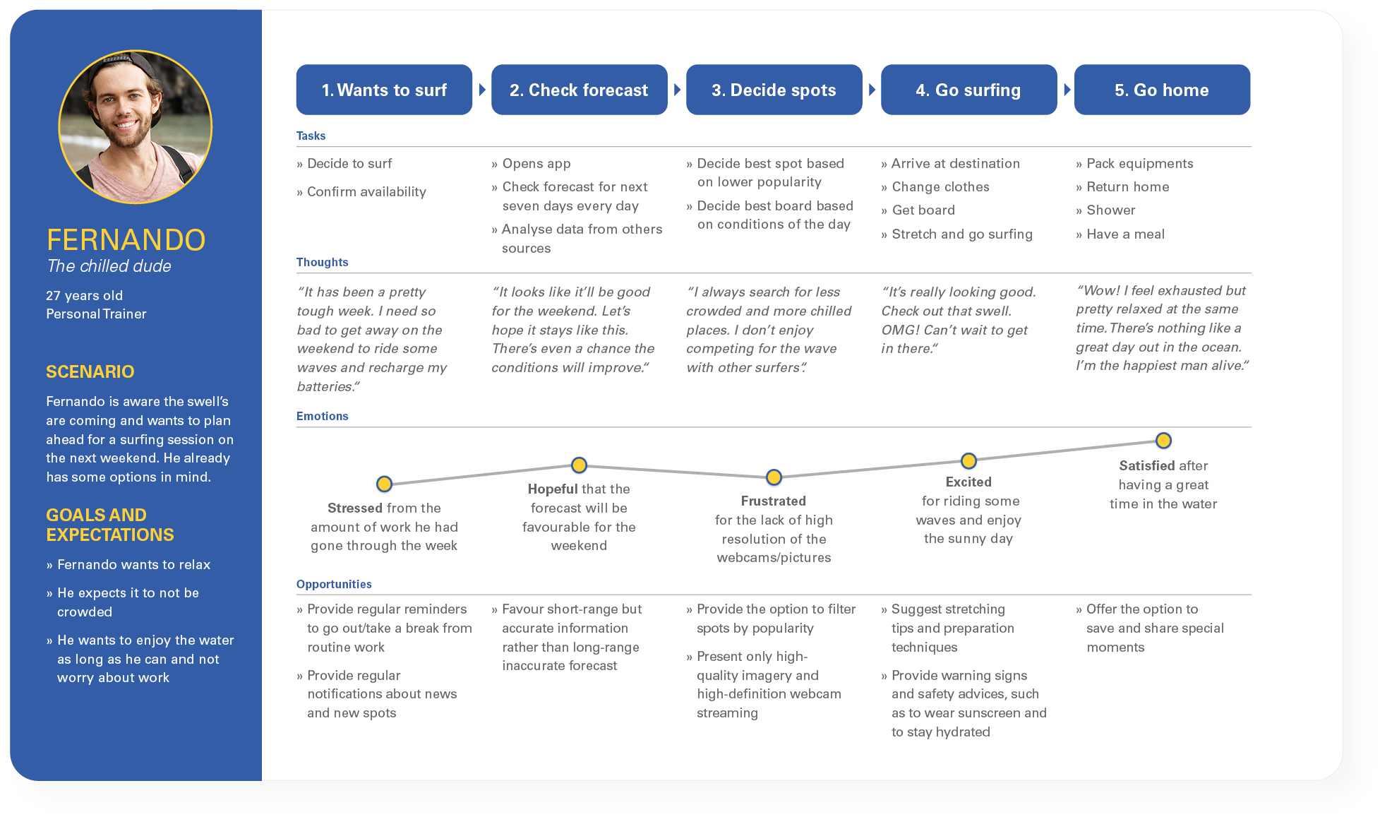
User personas
Two user personas were created based on the research. Amanda, an energetic mom, who's an oceanographer, into meditation and sustainability, and Fernando, a chilled dude, who's a personal trainer very active on social media and that have lived by the coast since he was born.
User journeys
To convey a visual story of the process each of the personas will work through to achieve their goal, I developed the user journeys.
Amanda is very excited to try her new board and is looking for the day and spot with the best conditions to go out, while Fernando is looking forward to the weekend and just wants to spend his day in a more reserved spot.
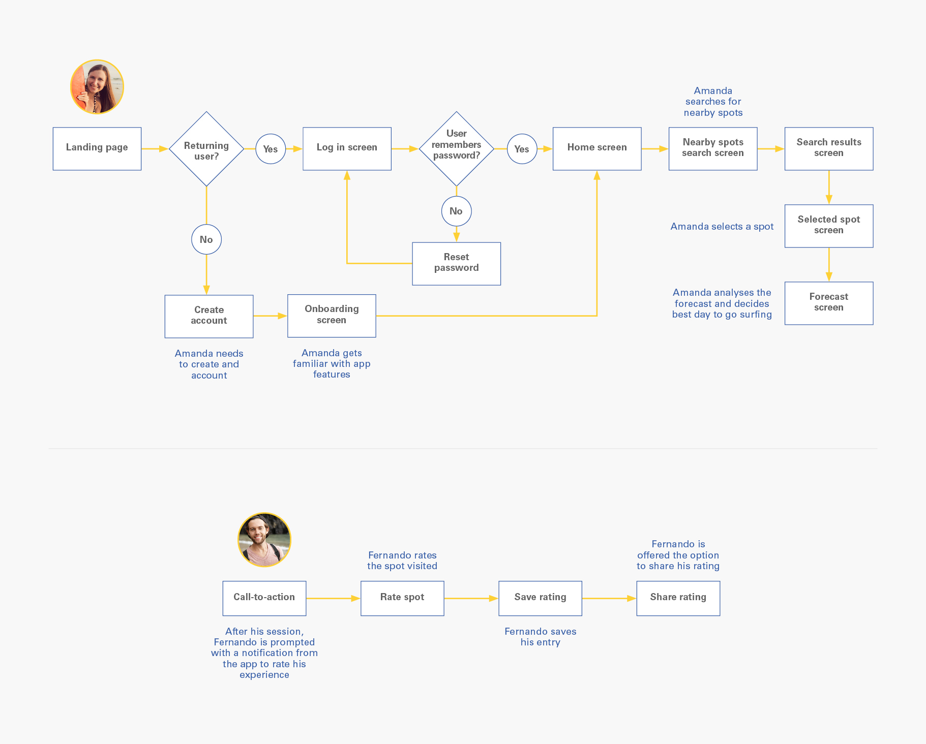
User flows
At this stage, it was necessary to create the user flows so I could discover what pages or screens of the app are needed, and most importantly, that the personas’ need has been satisfied at every point in the flow.
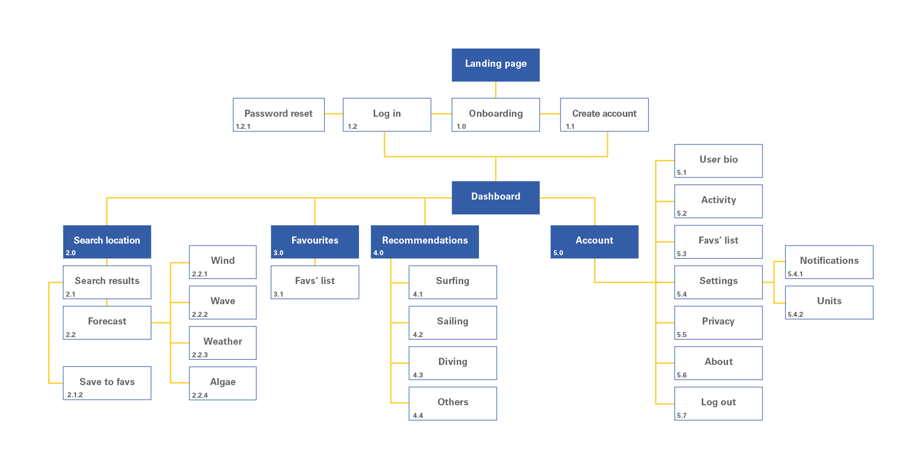
Sitemap
Time to establish information architecture. I conducted a digital card sorting test with 7 participants to refine the sitemap using OptimalSort by Optimal Workshop. From that, I have collected some findings that resulted in the structure below.
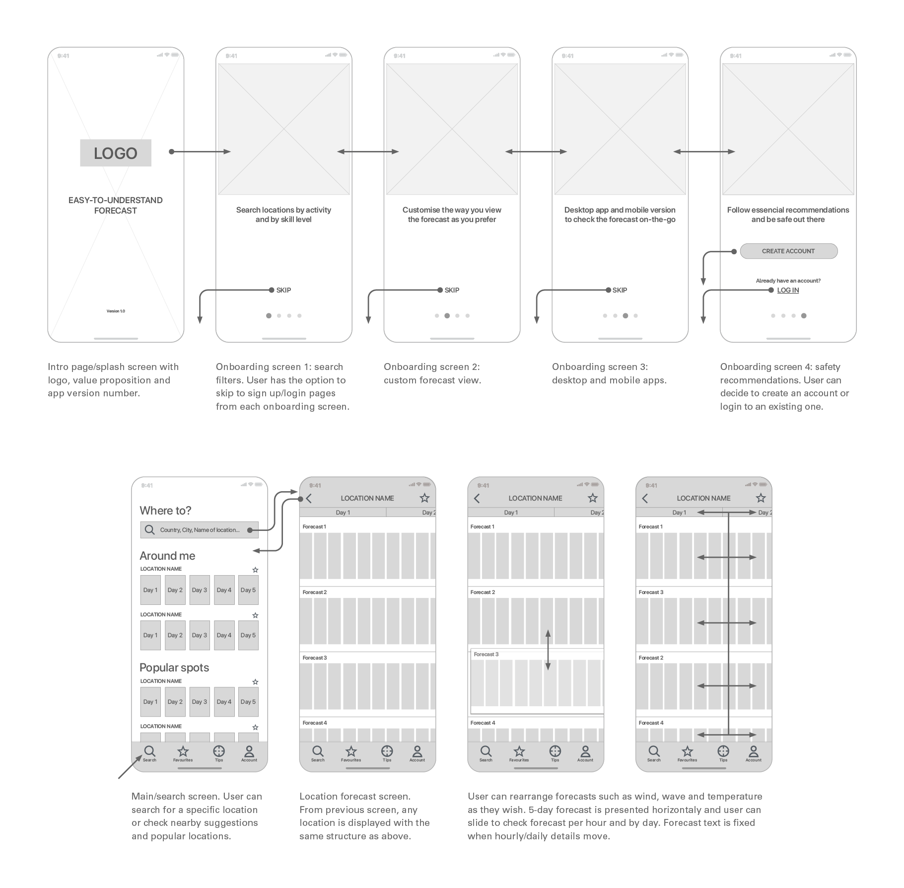
Mid-fidelity wireframes
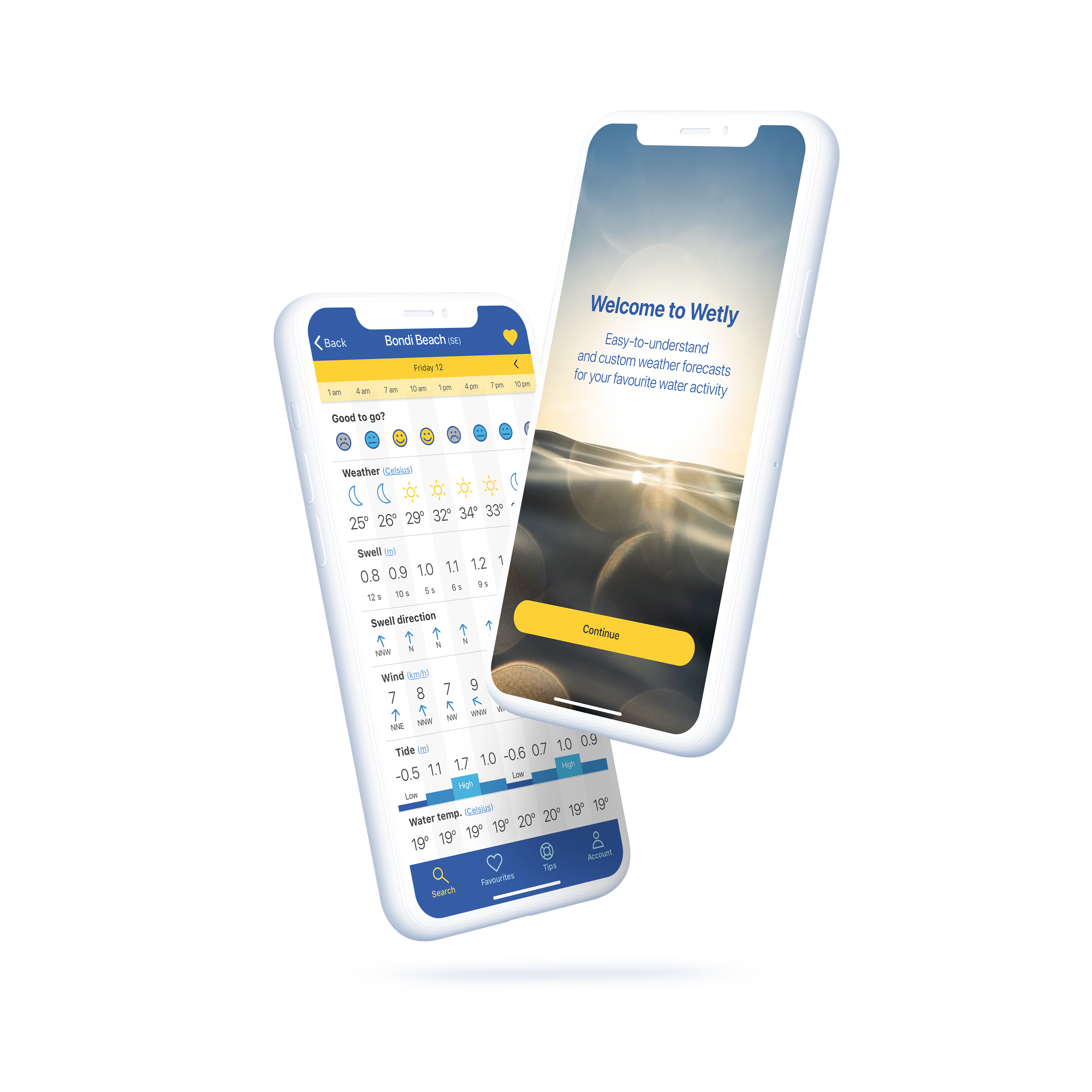
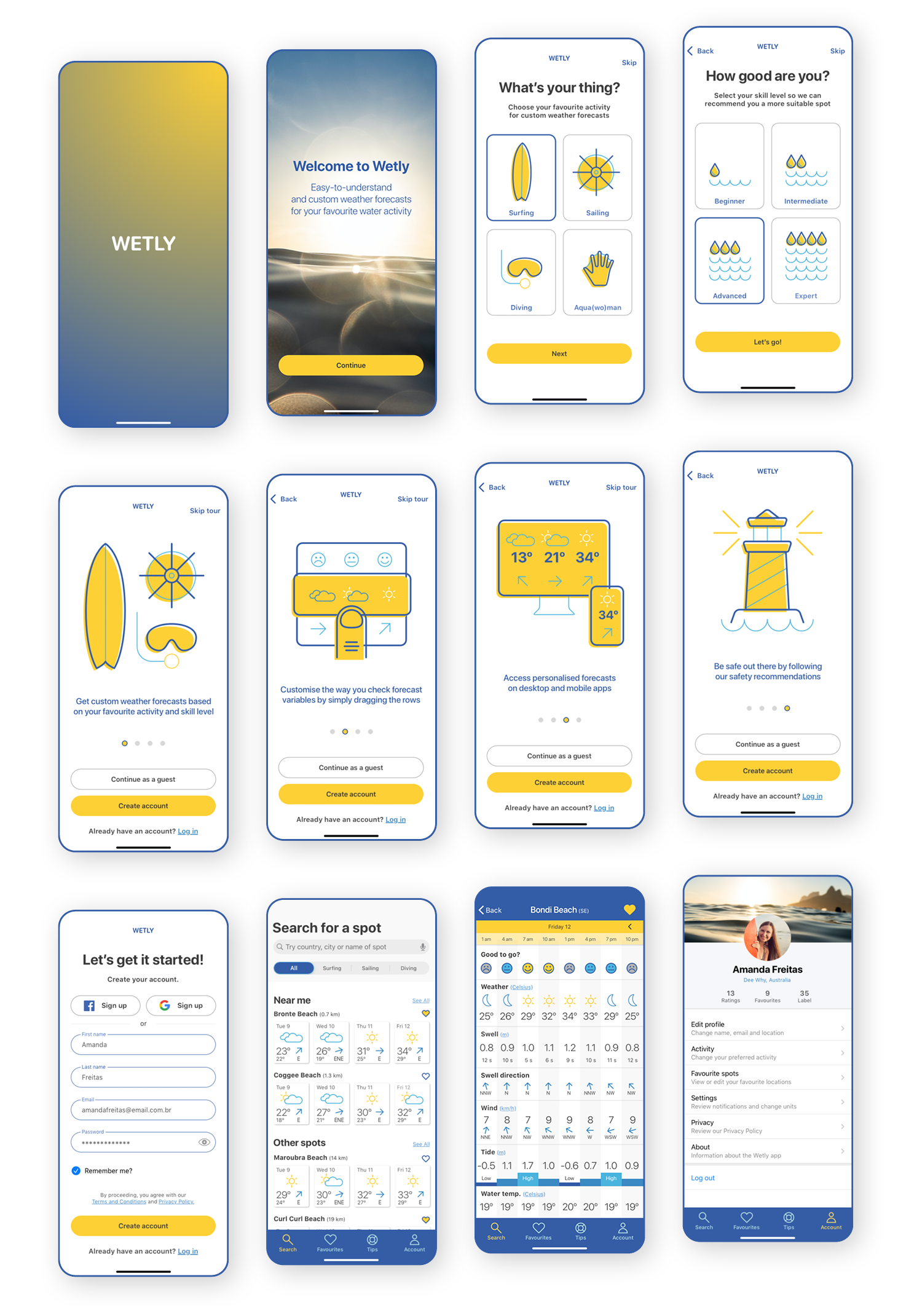
With all this information at hand so far, it was the moment to develop a clickable prototype. The initial sketches evolved from low- and mid- to high-fidelity wireframes which I then used for the usability tests. Below is a snapshot of the onboarding process and the search/forecast screens.
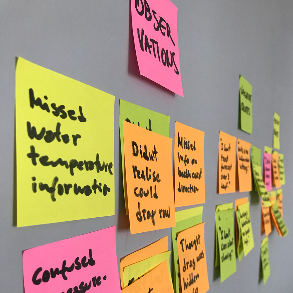
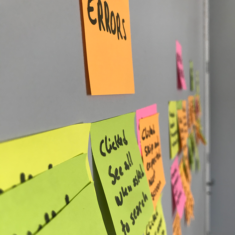
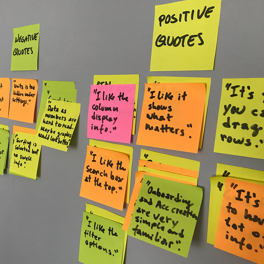
Affinity map after usability tests
With the clickable prototype created using InVision, I conducted 6 moderated remote usability tests within a week's time using Lookback online tool. All tests were successfully completed, and following my test script was extremely helpful to guide me through the study and extract the information I initially planned to have. Below are the notes I took to create the affinity map and refine my designs based on higher-severity errors. The Rainbow Spreadsheet can be accessed here.
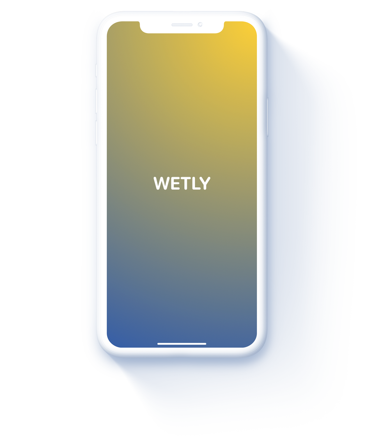
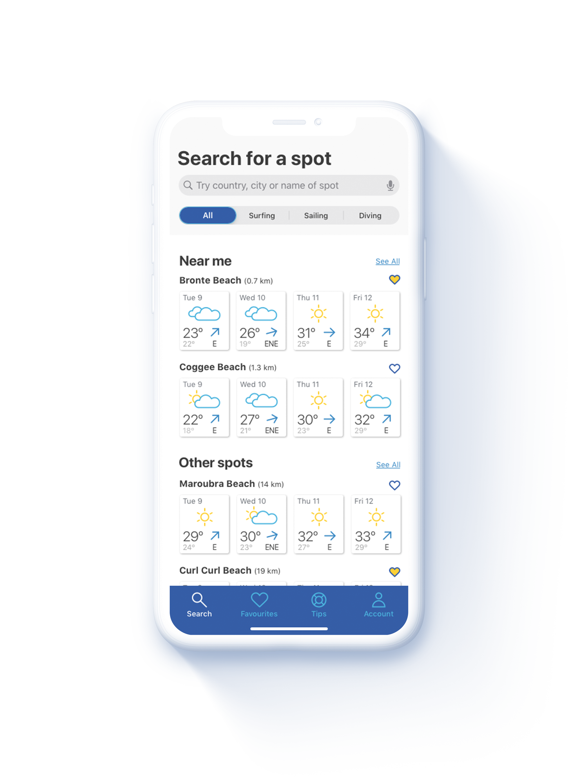
Final screens
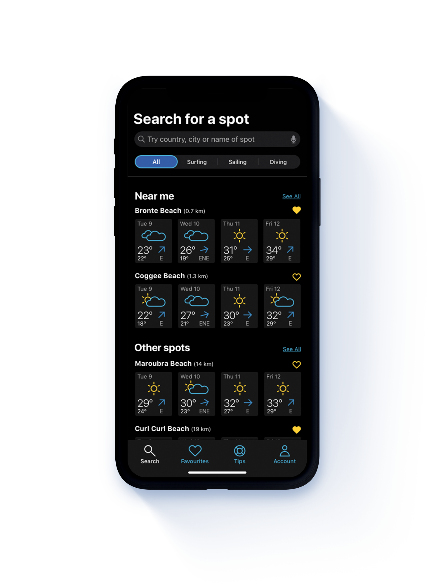
Move slider horizontally to alternate between light and dark modes.
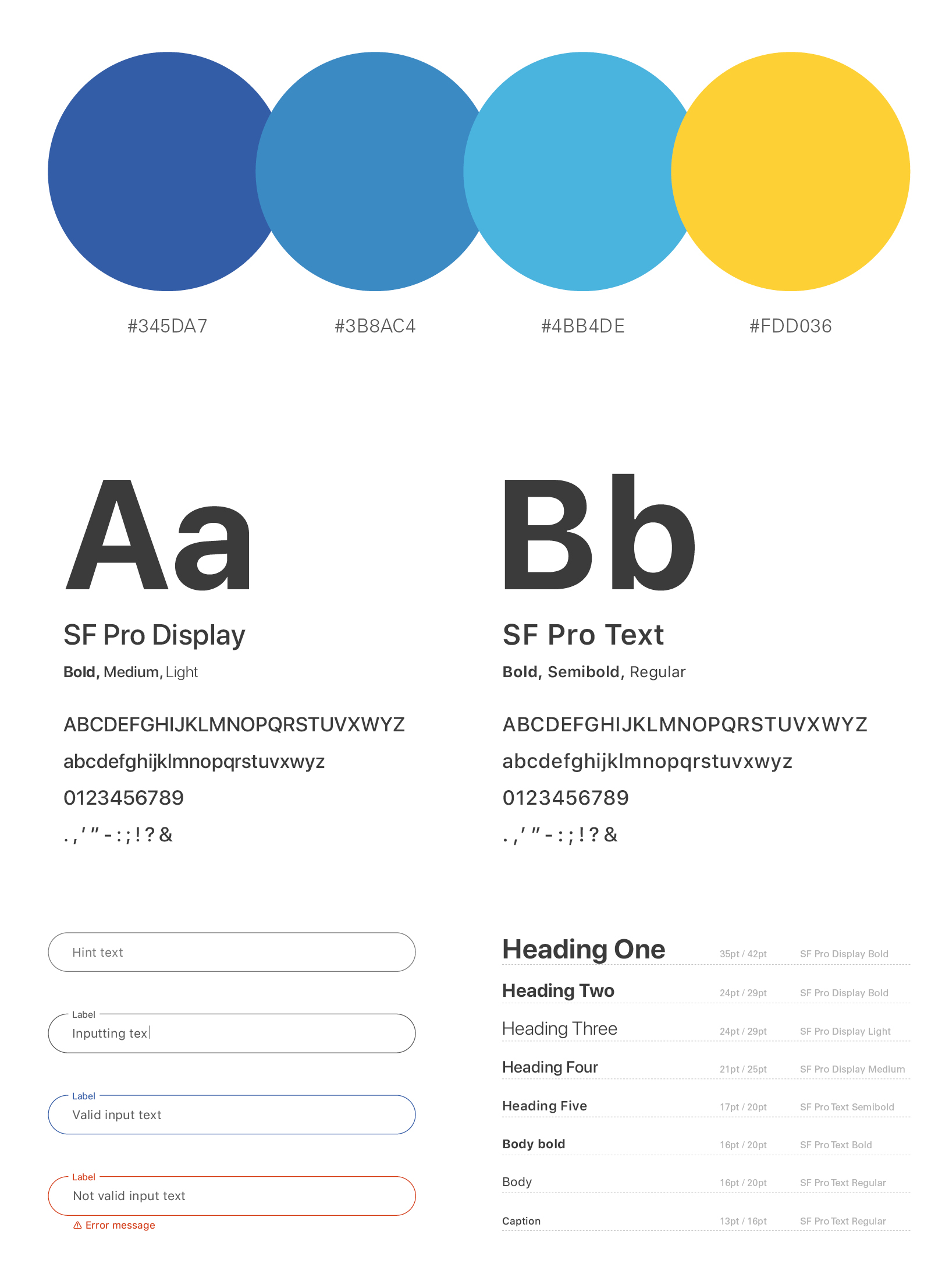
UI elements
Here is a collection of the UI elements used for the screens I have developed so far. Further down the road, the icon set could be expanded to include more weather conditions, and how the elements and screens could be animated would also be documented here.