Overview
Portugal Space is Portugal’s national space agency and is tasked to implement and bring forward and renew Portugal’s strategy in space. The agency is engaged in all areas of science and exploration, safety and security (including defence), Earth observation, telecommunications, navigation, and operations for the benefit of all economic sectors, such as agriculture, fisheries, urban development, transportation, shipping, energy, and communications, to name a few. As a newly founded space agency, the agency was looking for support to design its logo and launched a worldwide open contest. Scroll down to find out more about this proposal.
CONTEXT
As a newly founded space agency, Portugal Space was looking for support to design its logo and launched a worldwide open contest that ran from late June through to late August 2019.
OBJECTIVE
The project briefing was to develop a logo that should deliver the following messages: young light, innovative, agile, open, creative, digital, modern, knowledgeable, attractive, autonomous, interactive, yours, national, European, and global.
APPROACH
My initial approach to this objective was to research the competitors, i.e., all the major space agencies in the world to gather information on what works well in other brand identities and also what doesn't. With this data at hand, I was able to start the brainstorming of ideas in order to create a unique, yet recognisable logo for the project.
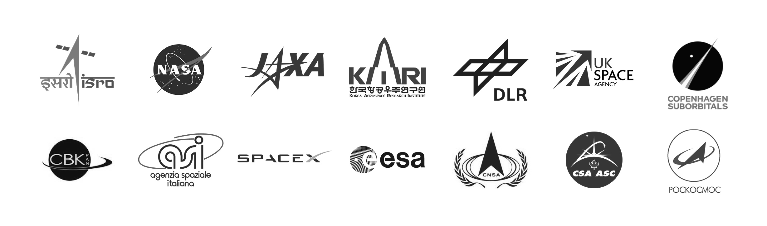
Competitors' research
Analysing the logos from other space agencies, I was able to notice interesting patterns that I saw the potential to develop further. One of them was these edgy graphical elements, possibly to convey innovation, technology, and/or speed, the aerodynamics of their spacecrafts. And the other one was these angled and directional elements, usually pointing up and forward, that can be translated to the launch of the rockets towards space.
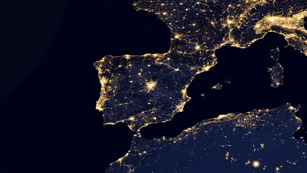
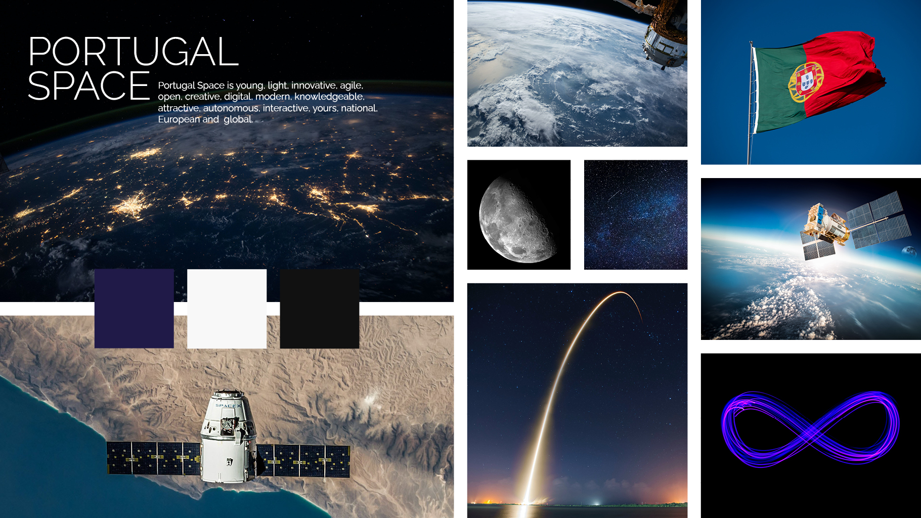
Mood board
The next step was to put together a mood board in order to help communicate the visual direction and establish the story I wanted to tell before diving directly into designing.
Logo design process
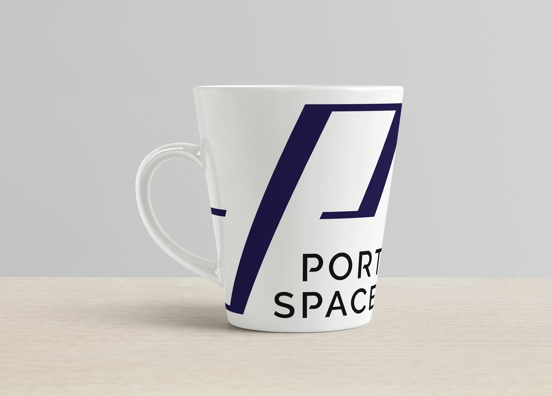
I started analysing the shape of the letters “P” (for “Portugal”) and “S” (for “space”) and realised that the “P“ could not only represent a wavy flag silhouette but also resemble the shape of the solar panel used on satellites. Another discovery during this stage was that the letter “S“ can be formed by combining two flipped letters “P”’.
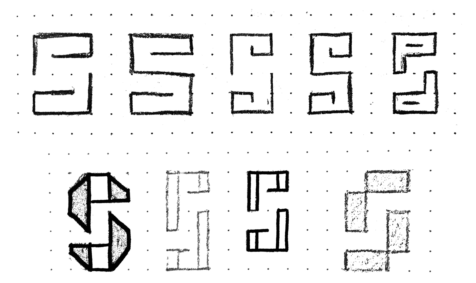
After some fine-tuning, I gave the shape an inclination of 65º to imply an agile forward and upward movement, as per the rocket being launched and in trajectory, while keeping its stability, lightness, symmetry (attractiveness), and digital feel.
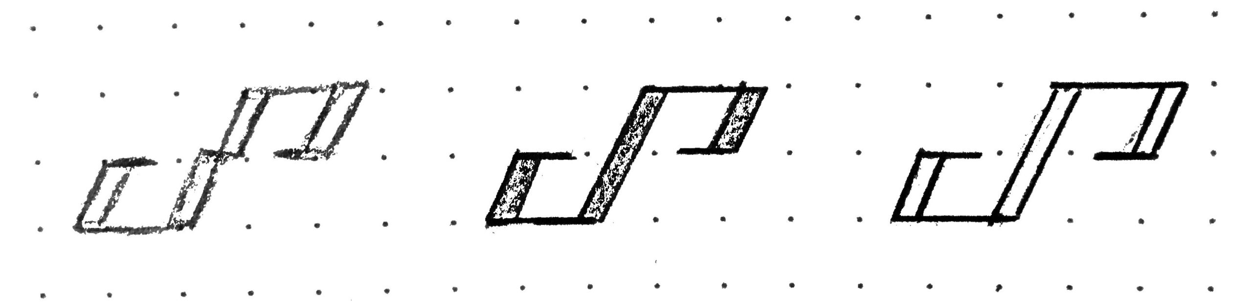
The refined shape was adapted to reflect the infinity symbol, which is a metaphor for the dimension of the space to be explored and also the curiosity and open-mindedness that made Portuguese people, successful explorers.
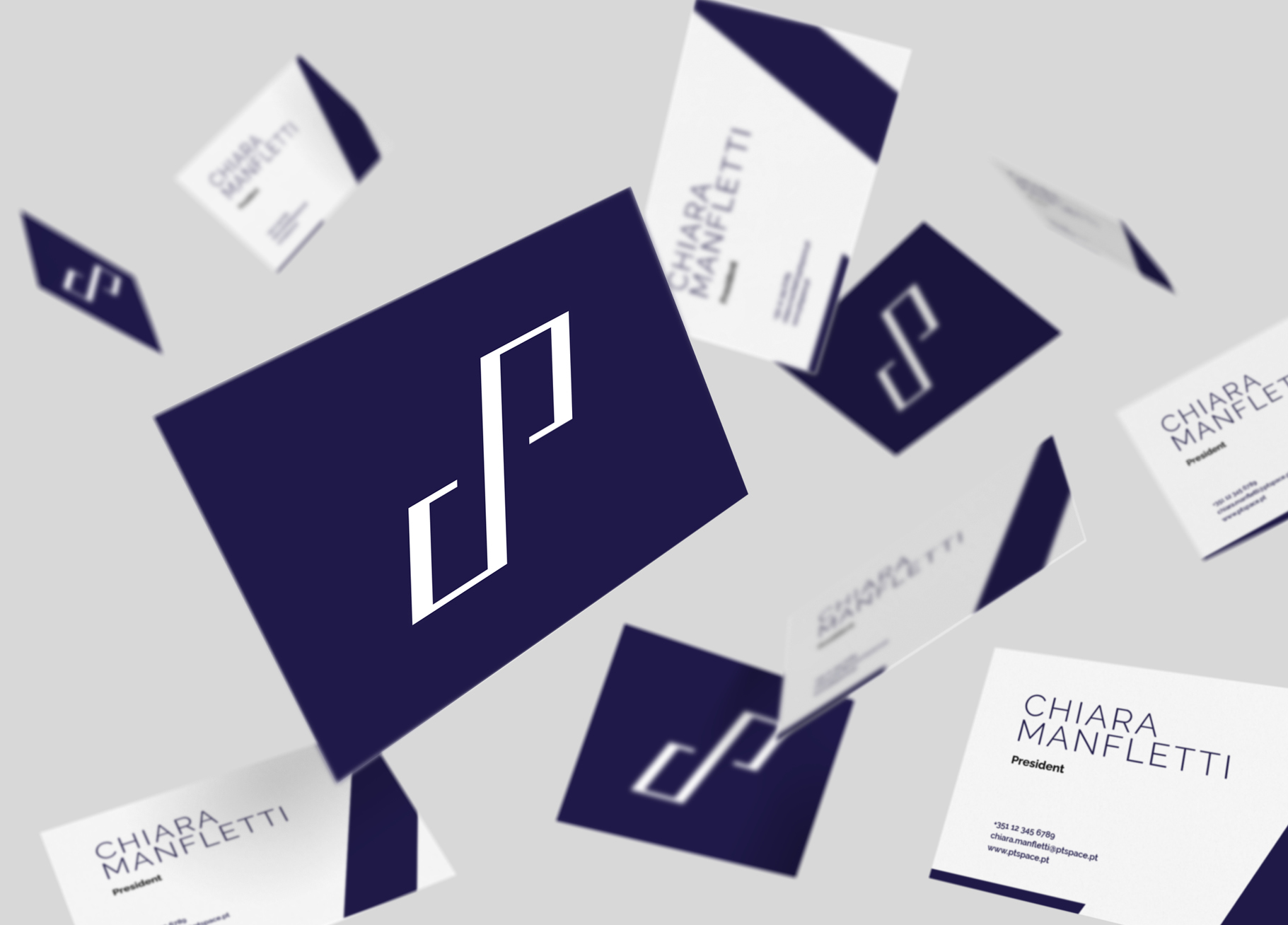
Refined logo design
Following up are the finalised version of the symbol, the complete signature, the construction grid, and other logo applications.


Move slider horizontally to view / hide the construction grid

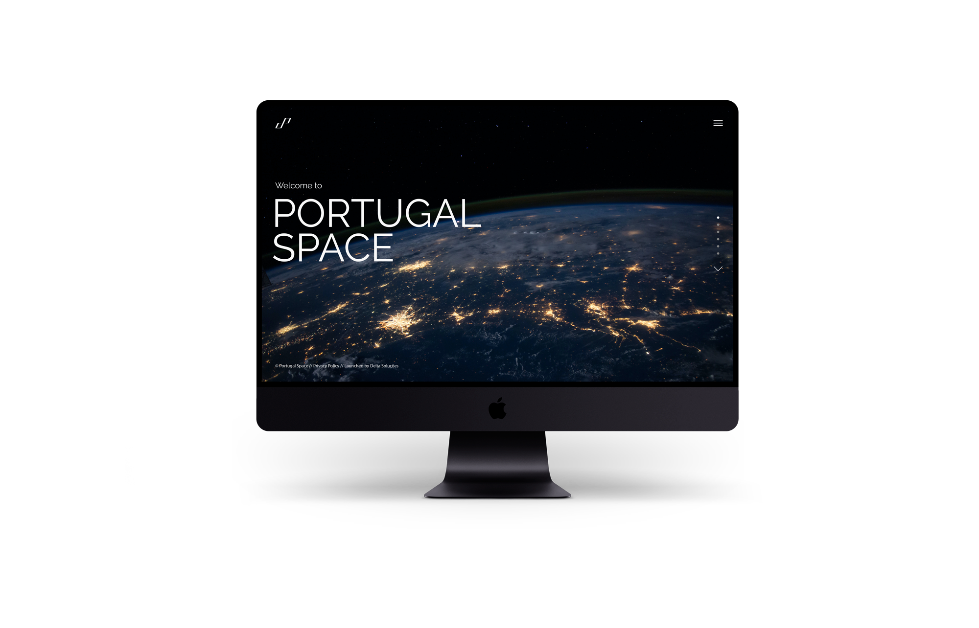
Landing page redesign
The user interface for the landing page was redesigned to match the look and feel of the new visual direction, adhering to the new brand messages—light, innovative, and modern.