Transforming a legacy video consultation tool into a trusted, intuitive platform for healthcare providers and patients
Summary
At Induction Healthcare, I led the UI redesign of a legacy video consultation platform used by patients, healthcare providers, and admin/support teams from NHS Trusts across all of the UK.
The previous experience suffered from usability issues, low user trust, and accessibility gaps that made it difficult for many users to effectively engage with the platform.
By simplifying key user flows, modernising the interface, and designing to meet accessibility standards (WCAG 2.2 AA), we delivered a more inclusive, intuitive, and reliable experience.
The result: improved adoption, reduced user errors, increased confidence, and a platform that is usable by a broader range of users, including those with disabilities.
Opportunity
The existing video consultation experience presented significant barriers to effective use, accessibility, and adoption.
Key issues
• Poor usability: unclear navigation and confusing interaction patterns
• Outdated interface: reduced credibility and trust in a healthcare setting
• Low user confidence: hesitation in relying on the platform for consultations
• Accessibility gaps: poor contrast, unclear focus states, limited keyboard support
• Limited digital literacy among users: especially patients unfamiliar with video tools
• Inconsistent performance perception: impacting reliability and satisfaction
Supporting signals
• High drop-off rates before successfully joining calls
• Increased support tickets related to call access and usability
• Negative qualitative feedback from users and internal teams
• Longer-than-expected time to complete key tasks (e.g. joining a consultation)
• Accessibility concerns raised through audits and compliance requirements
These issues directly impacted the effectiveness and inclusivity of remote care delivery, making improvement a critical priority.
The legacy experience featured cluttered layouts, unclear primary action, and accessibility issues such as poor contrast text and no visible focus states.
Role and team
As the Senior Product Designer (UI/UX), I was the primary owner of the user interface design, responsible for shaping the experience from concept through to delivery.
Responsibilities
• Designing core UI components and interaction patterns
• Creating low- and mid-fidelity wireframes and prototypes
• Defining detailed interaction behaviours and edge cases
• Producing design specifications for developer handoff
• Ensuring designs met WCAG 2.2 Level AA accessibility standards
• Collaborating closely with engineers during sprint cycles to ensure design quality and accessibility compliance
Team
• Head of Product
• UX / UI Designers
• UX Writer
• Business Analyst
• Project Managers
• Engineers / Developers
I played a key role in ensuring consistency, usability, and accessibility across the product.
Approach
We approached the redesign by balancing user needs, business goals, technical constraints, and accessibility requirements.
Strategy
Redesign the existing experience while maintaining essential workflows, ensuring improvements were meaningful, feasible, and compliant with accessibility standards.
Process
• Product data analysis on features, settings, framework, and content available for each user: admin/support, healthcare providers and patients
• Competitor analysis to identify best practices, solve similar challenges, and uncover innovation opportunities
• Audited the current product to identify usability and accessibility gaps
• Aligned with stakeholders on priorities and constraints, including mandatory accessibility compliance
• Iteratively developed wireframes and prototypes
• Incorporated continuous feedback from cross-functional teams
• Delivered designs in sync with agile sprint cycles
The focus was on practical, high-impact improvements rather than a complete rebuild and accessibility was treated as a core requirement, not an afterthought.
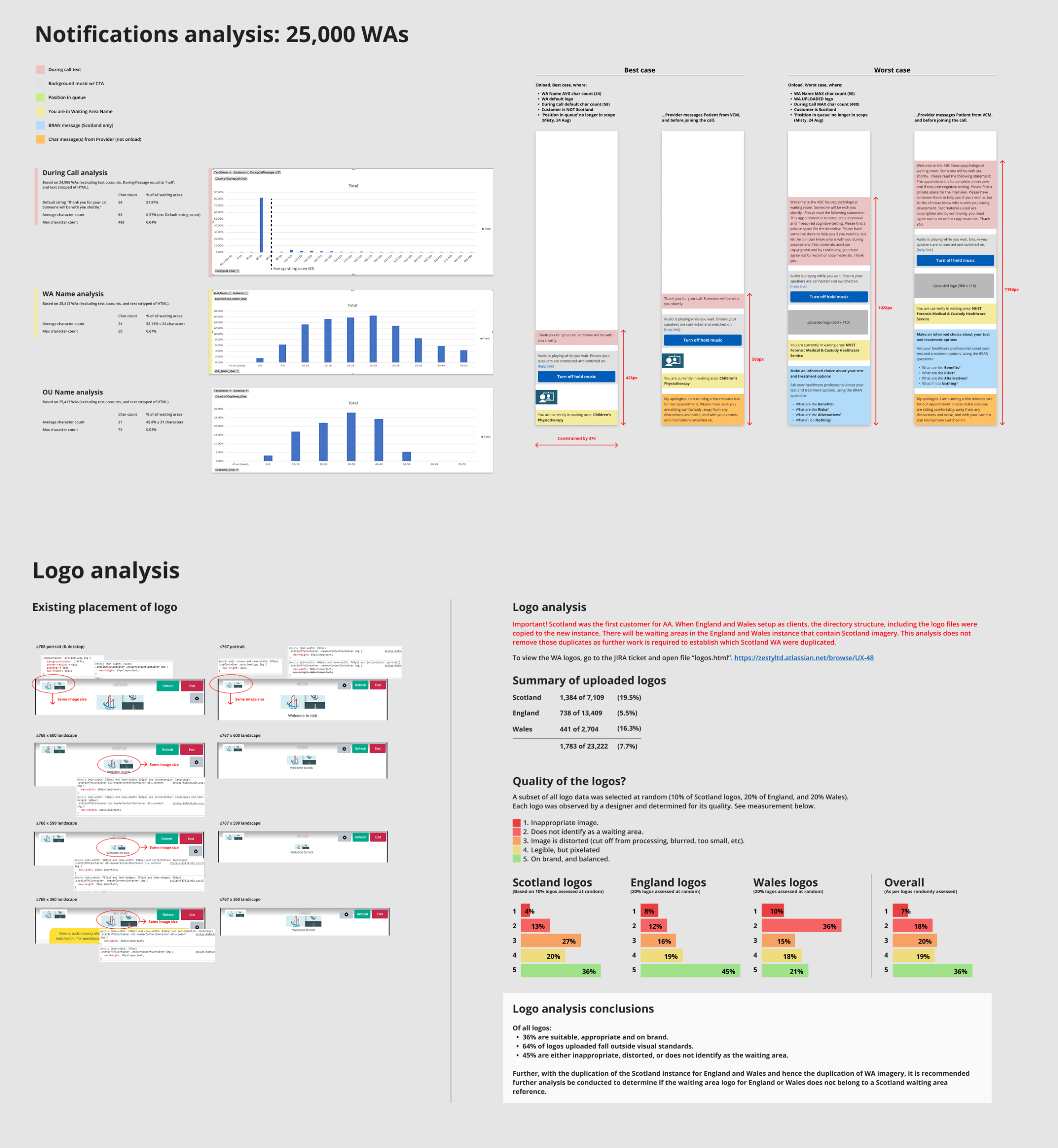
User behavior and content insights guided key decisions on what to include and exclude in the redesign.
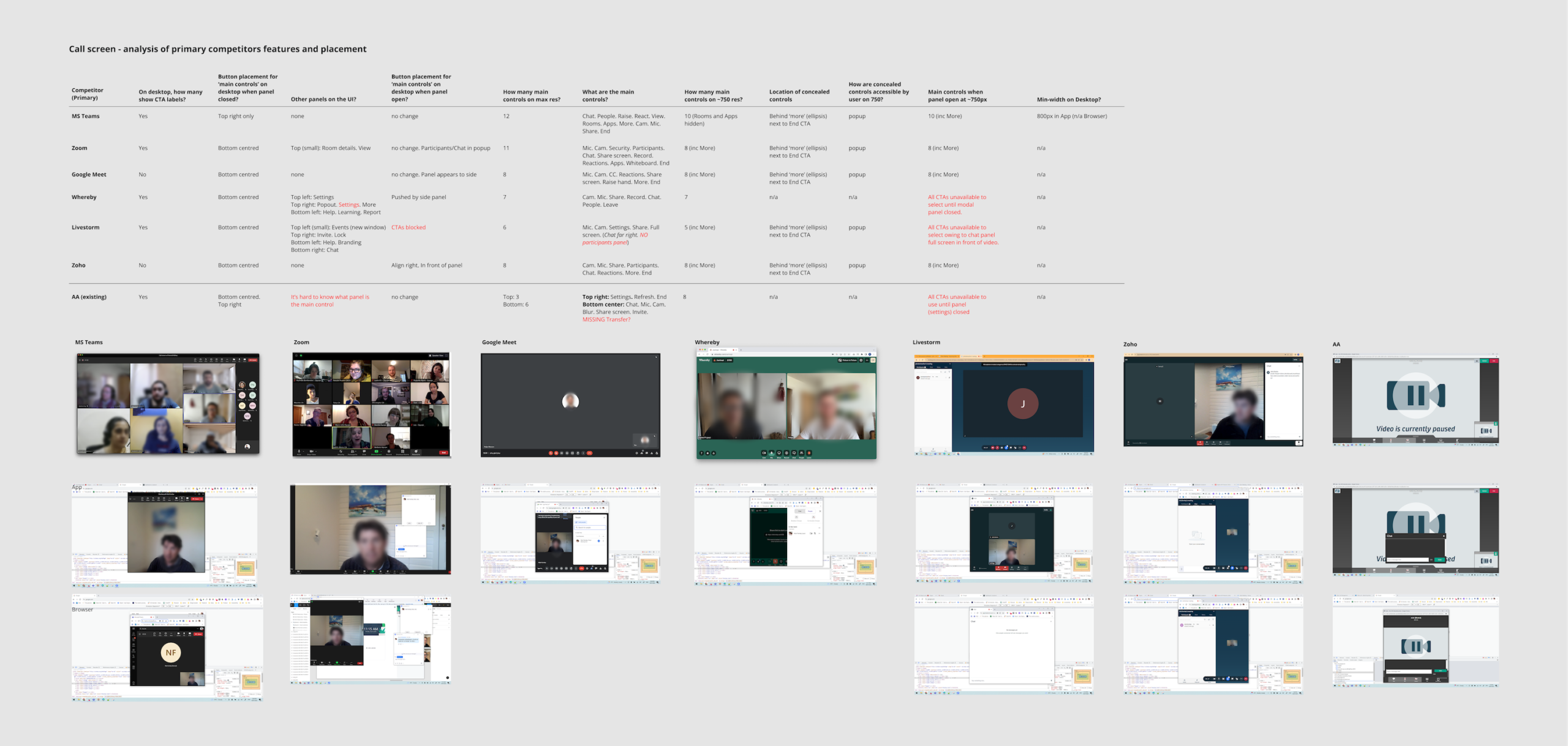
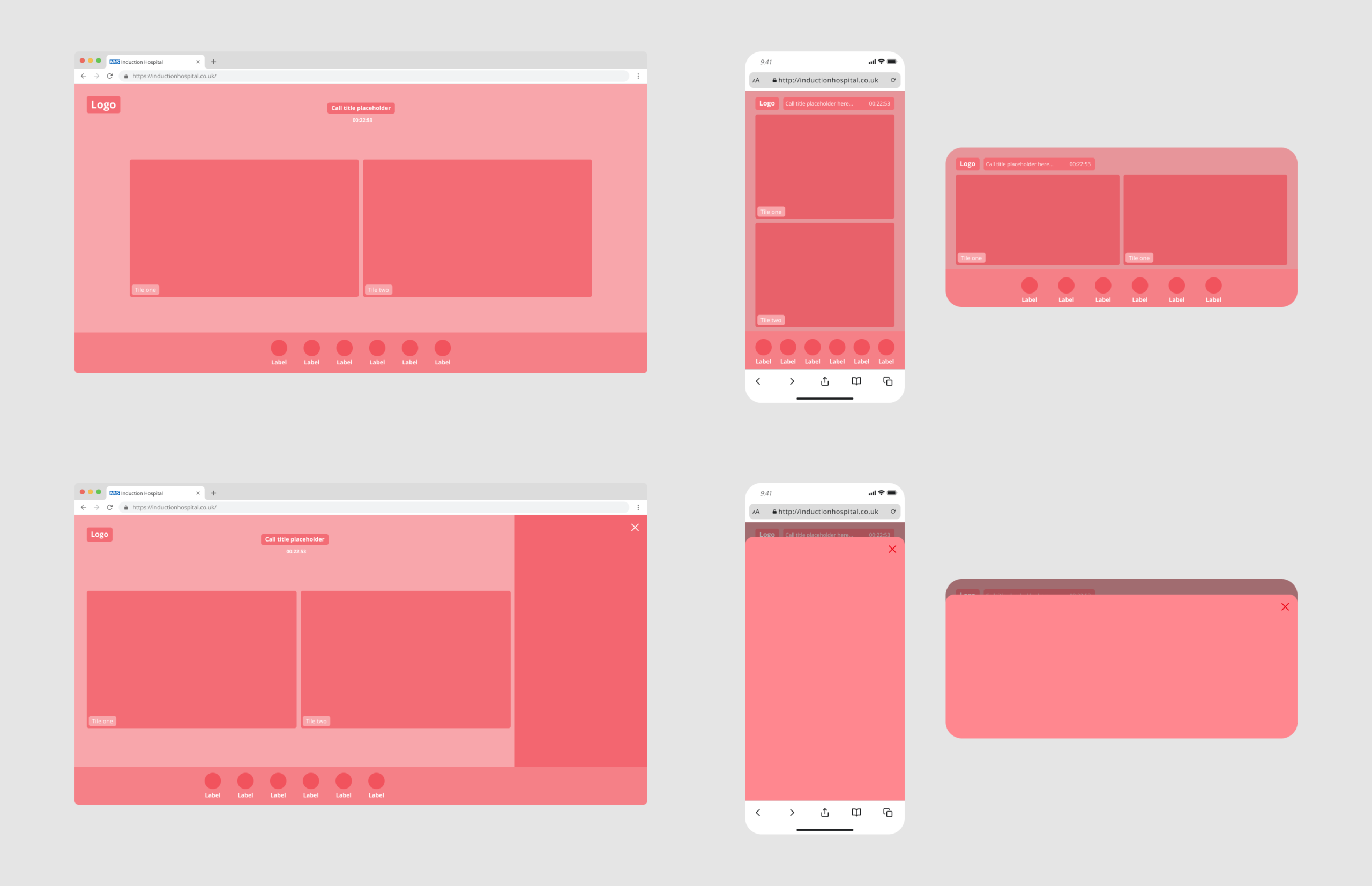
Overview of the most relevant competitors in today’s market analysed for this project.
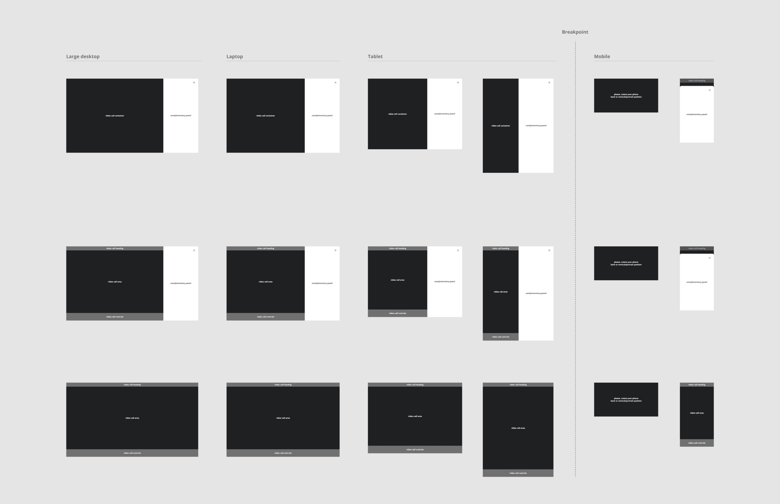
Layout framework after deep analysis for a custom and intuitive experience.
Early wireframes focused on simplifying core flows and reducing cognitive load during critical actions.
Key design decisions
• Simplified core flows to reduce cognitive load for users under pressure
• Improved visual hierarchy to guide users through critical actions
• Standardised interaction patterns for consistency and predictability
• Modernised UI to increase perceived trust and professionalism
• Responsive design to accommodate different devices and user needs
• Designed for accessibility, including:
- Improved colour contrast
- Clear focus states for keyboard navigation
- Accessible form and interaction patterns
- Consideration for screen readers and assistive technologies
Every decision was driven by clarity, inclusivity, and user confidence.
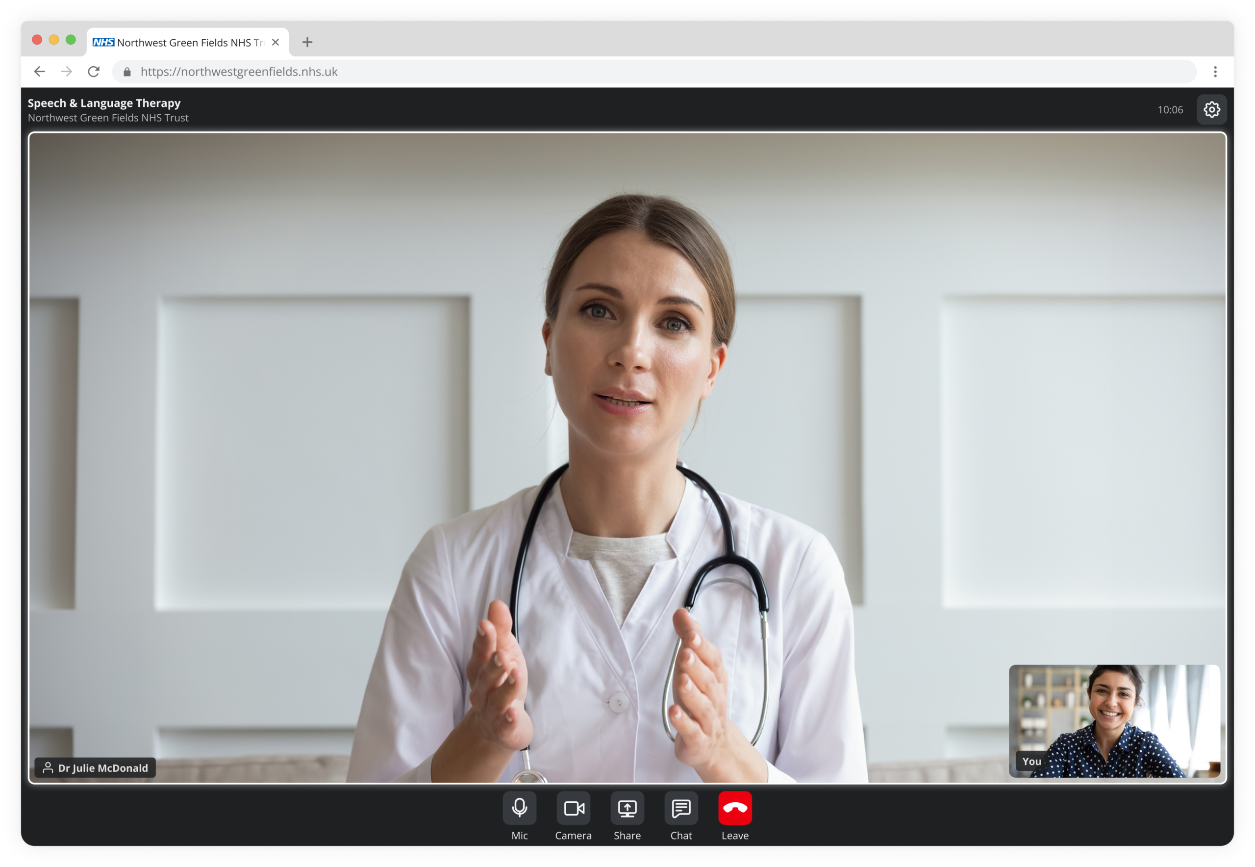
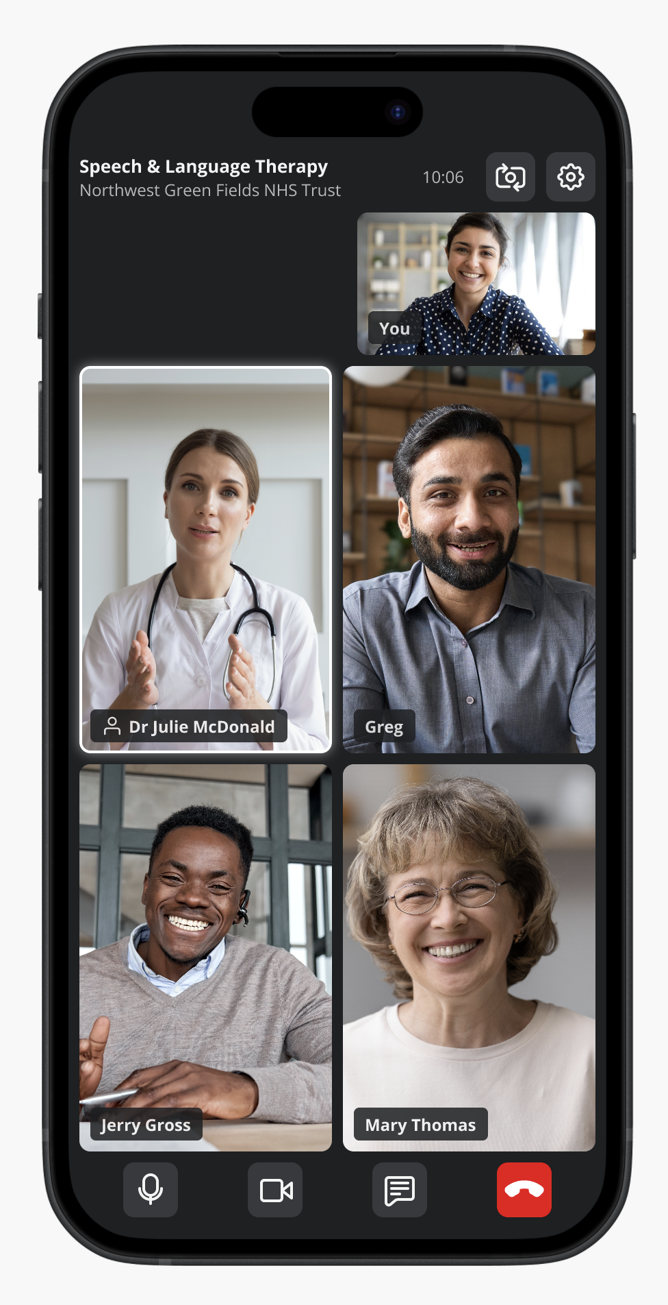
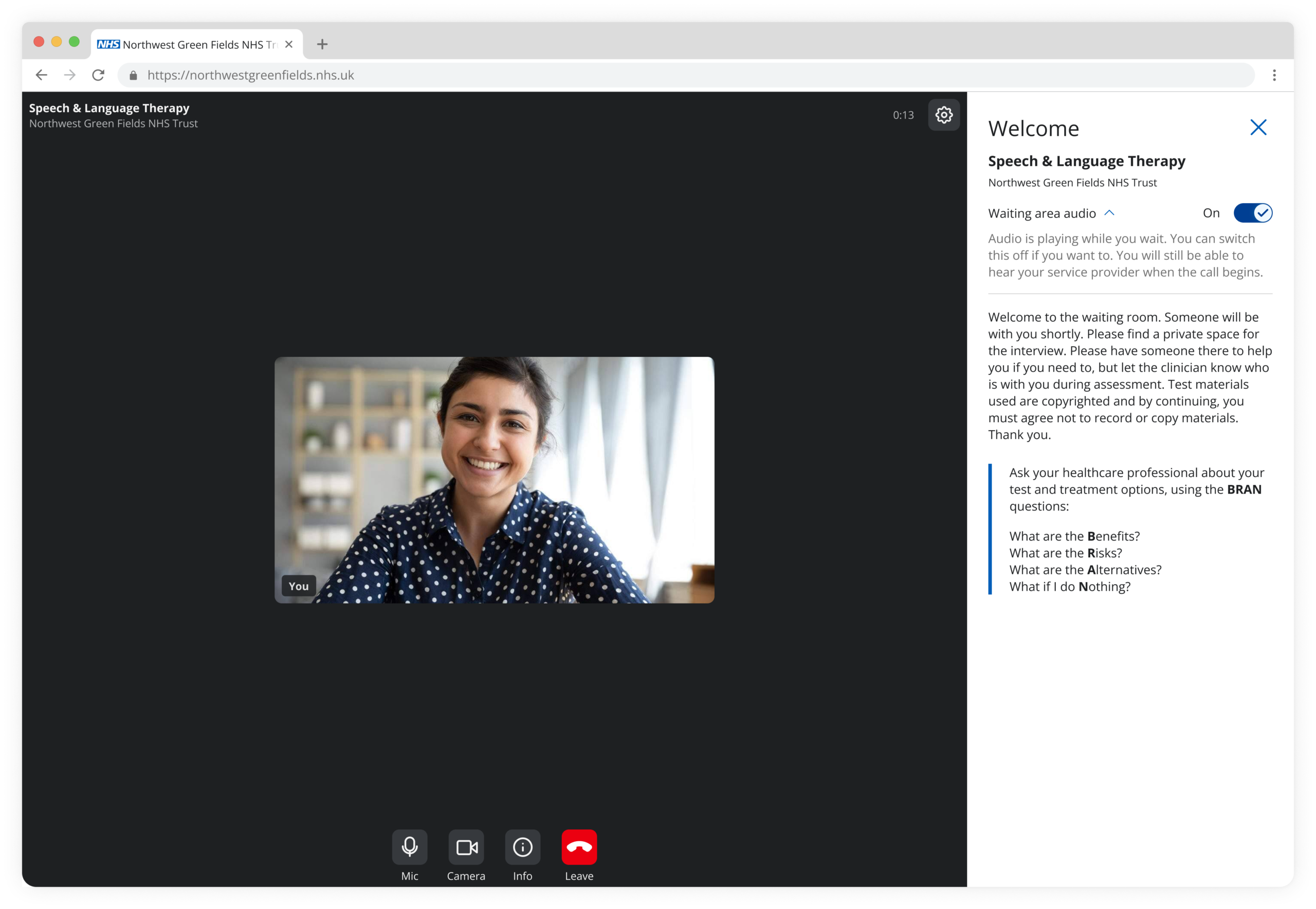
The redesigned interface introduced clearer hierarchy, simplified actions, and a more modern, trustworthy visual language.
Before: Cluttered and unclear
After: Focused and guided
Challenges
The project required navigating several real-world constraints:
• Limited engineering resources
• Tight delivery timelines
• Trade-offs between core functionality and experience enhancements
• Additional effort required to meet accessibility compliance standards
• Design inconsistencies during implementation requiring rework
• Multiple review cycles revealing gaps between design and build
How I handled this
• Prioritised must-have features, including accessibility requirements (non-negotiable baseline)
• Worked closely with developers to ensure accurate implementation
• Created detailed specifications to reduce ambiguity
• Maintained flexibility to adapt designs within constraints
Balancing speed, quality, and accessibility required constant prioritisation and strong cross-team collaboration.
Accessibility
Accessibility was a core requirement throughout the redesign. We designed the experience to meet WCAG 2.2 Level AA standards, ensuring the platform was usable by everyone, including users with disabilities.
Improvements included enhanced colour contrast, clear focus states, effective target areas, keyboard navigation support, and structured content using semantic labels to enable screen reader compatibility.
As a core requirement for web accessibility, all interactive elements are reachable and operable via the Tab key.
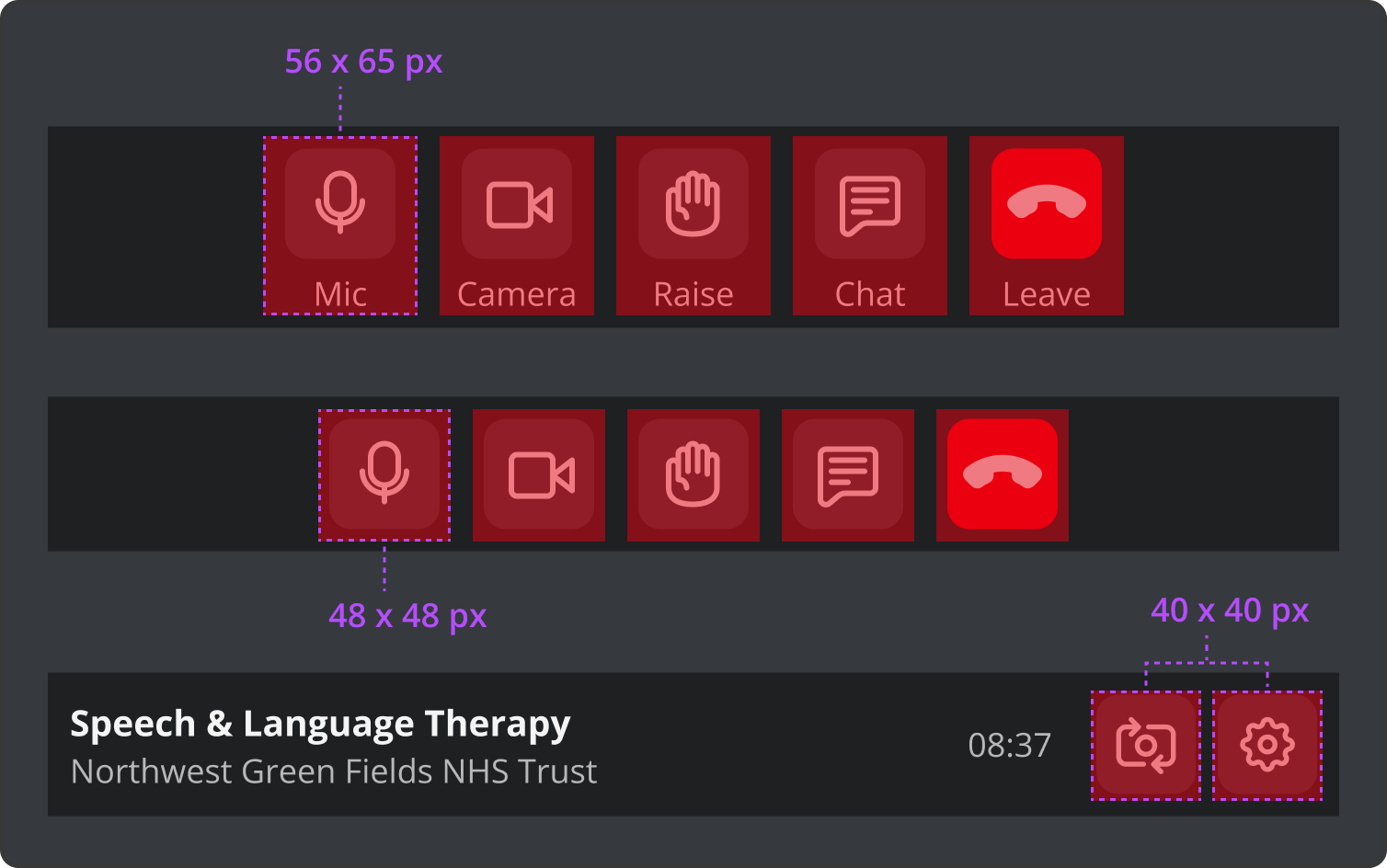
Generous target sizes to prevent accidental clicks, aid users with motor impairments, and reduce mobile frustration.
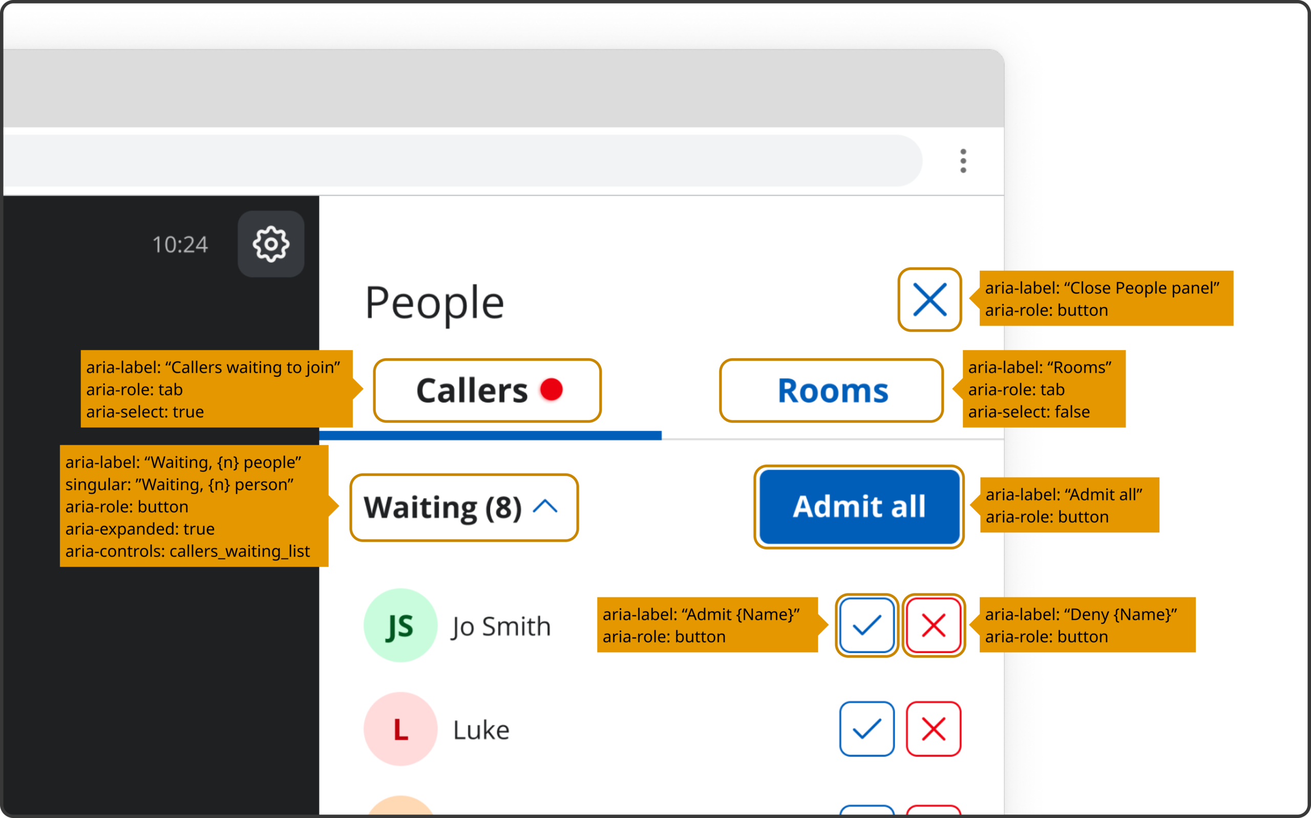
Screen elements include descriptive labels to provide meaningful context for screen reader users.
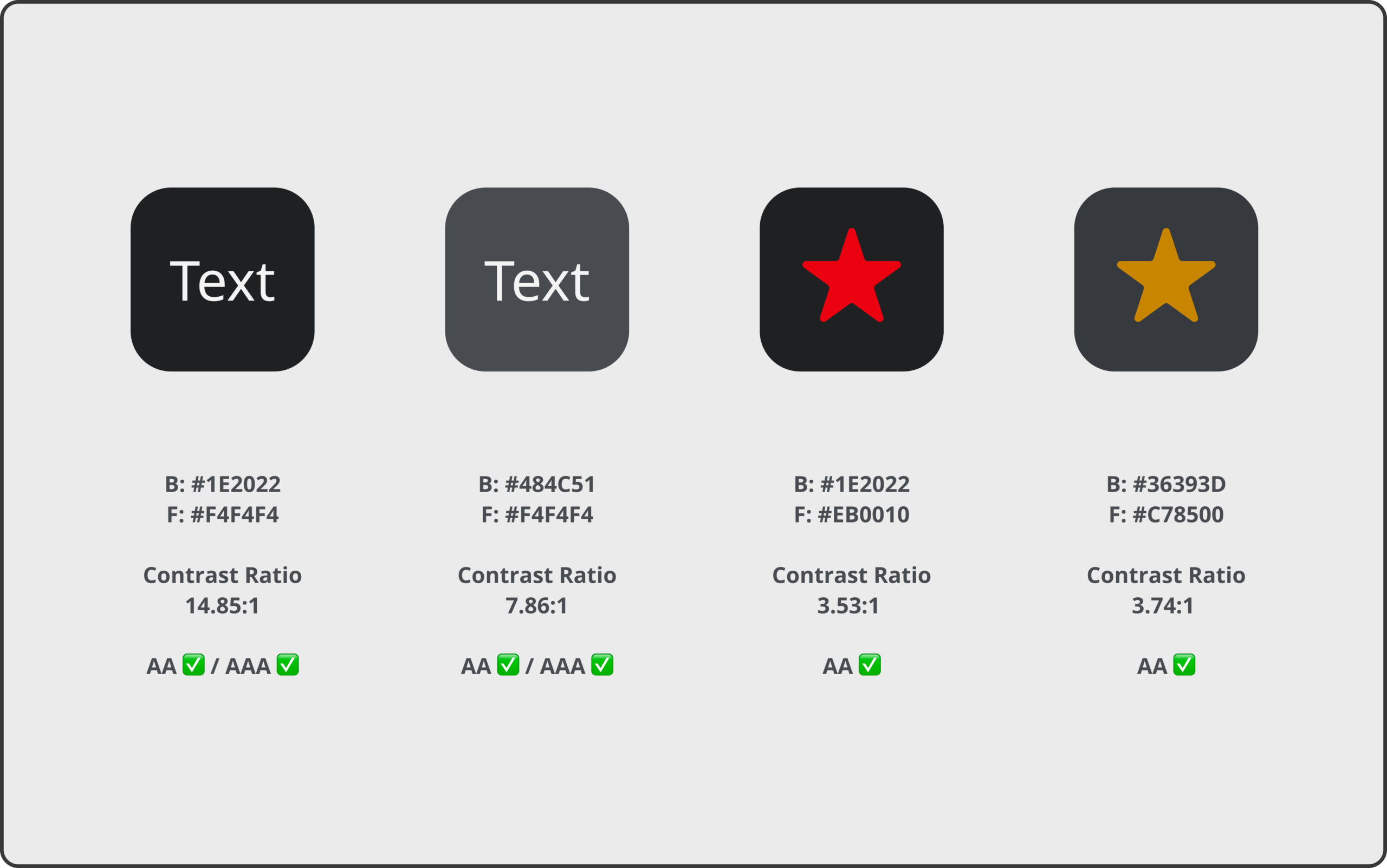
Colour contrast ratios were validated against WCAG 2.2 AA standards, with selected elements achieving AAA compliance for enhanced readability.
Accessibility influenced the design decisions from the start — shaping structure, interaction patterns, and component behaviour.
Key screens
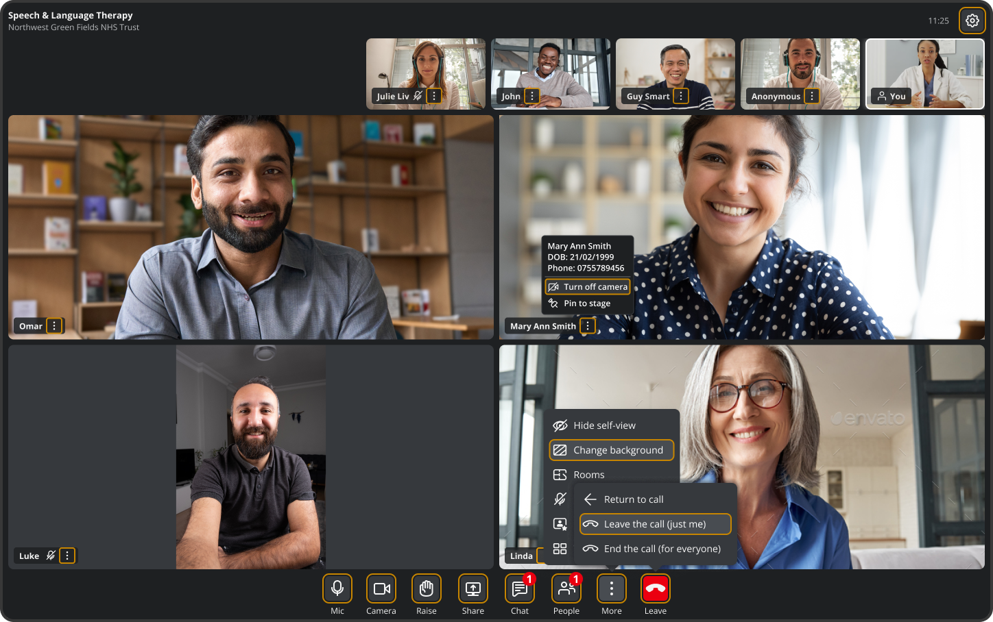
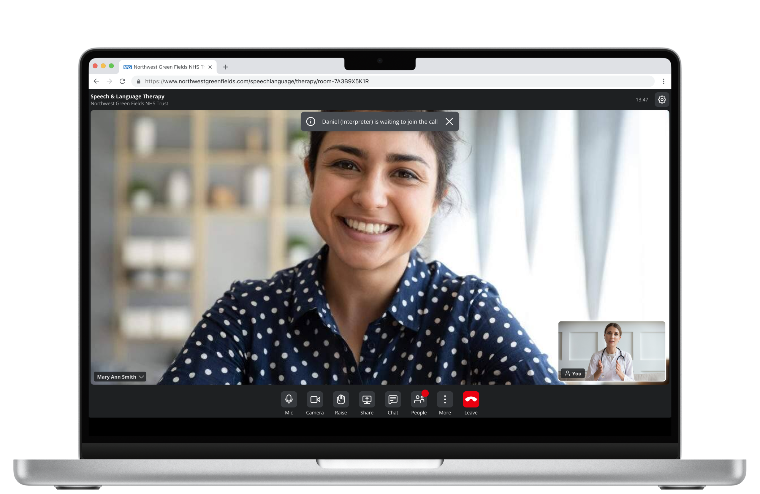
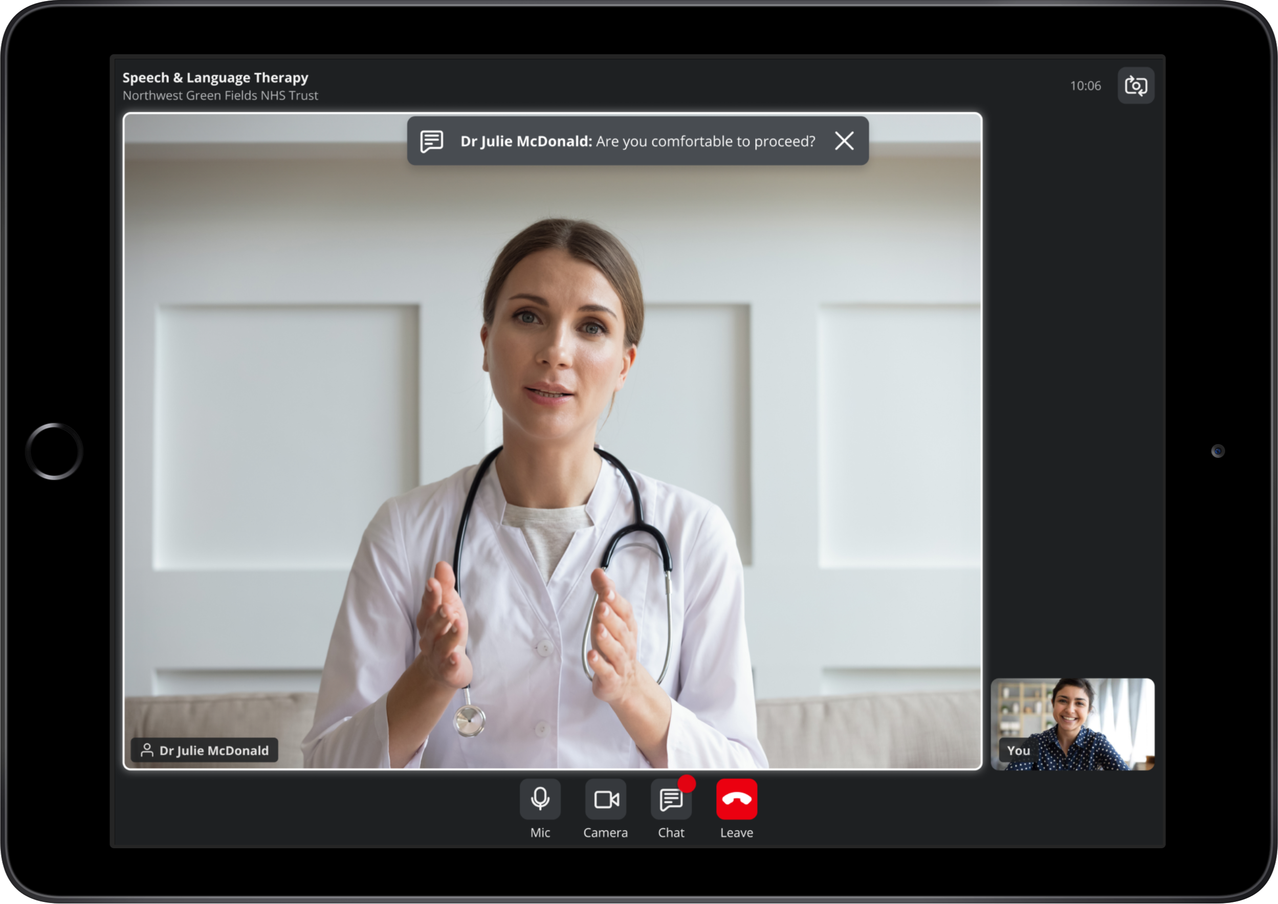
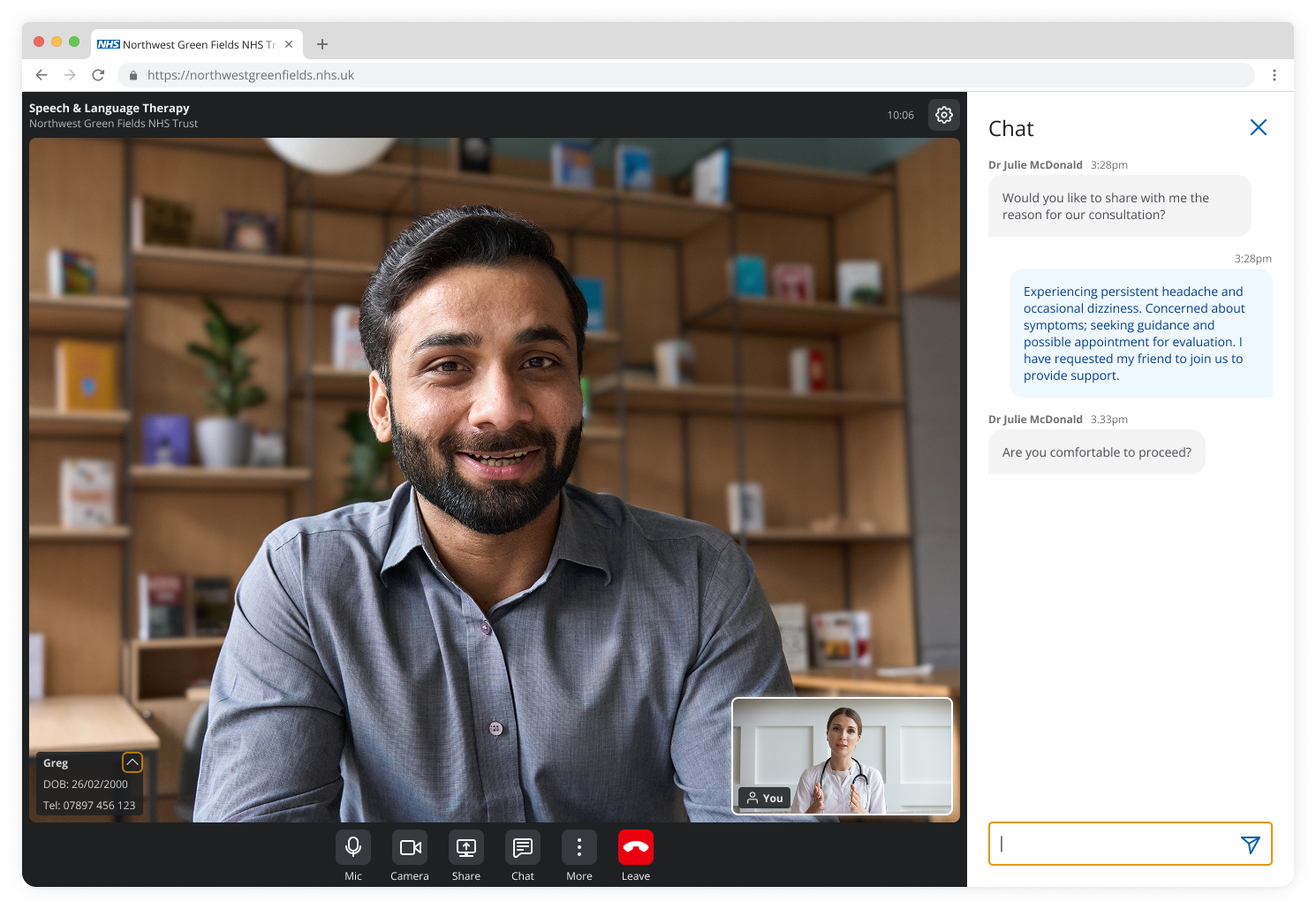
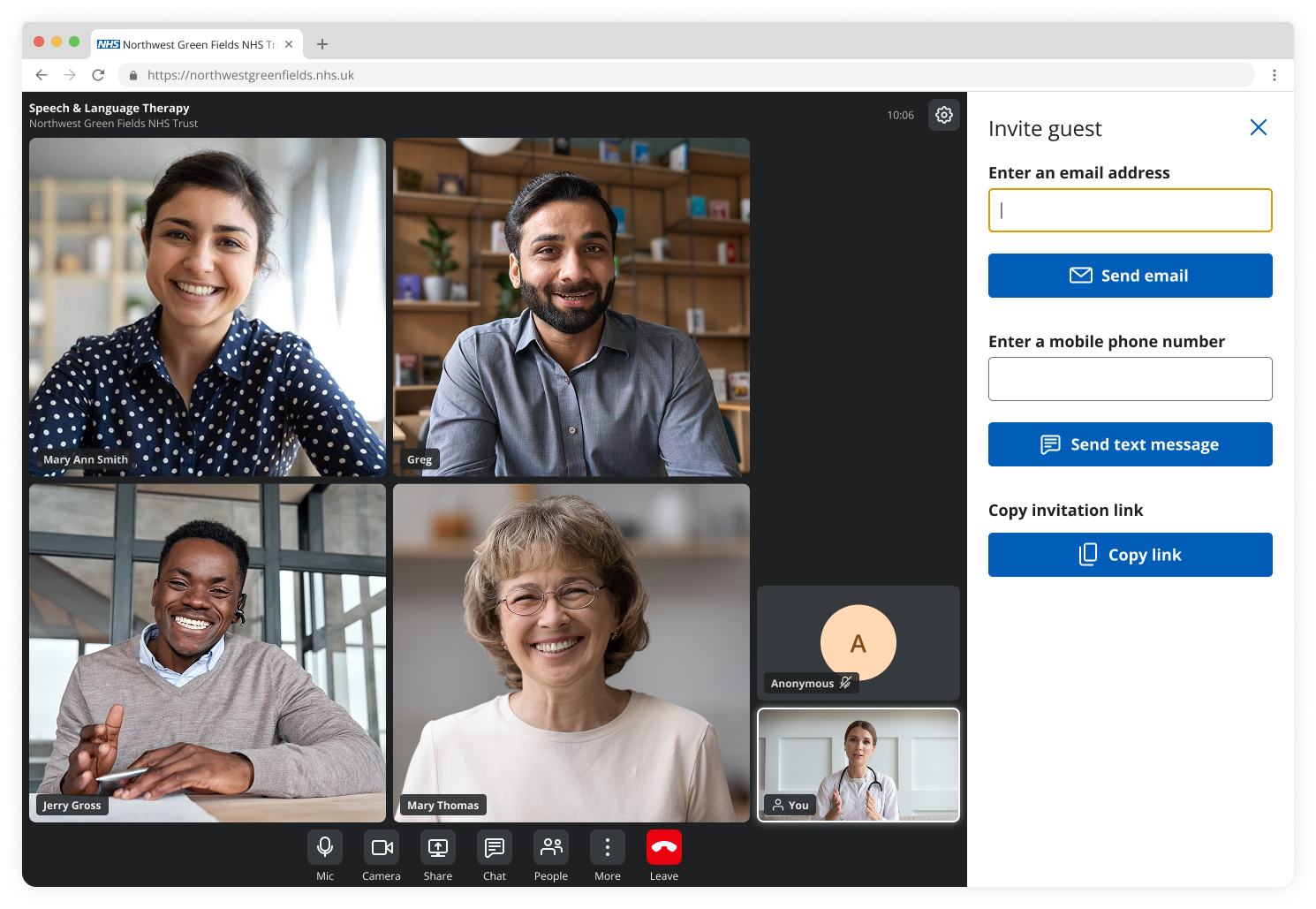
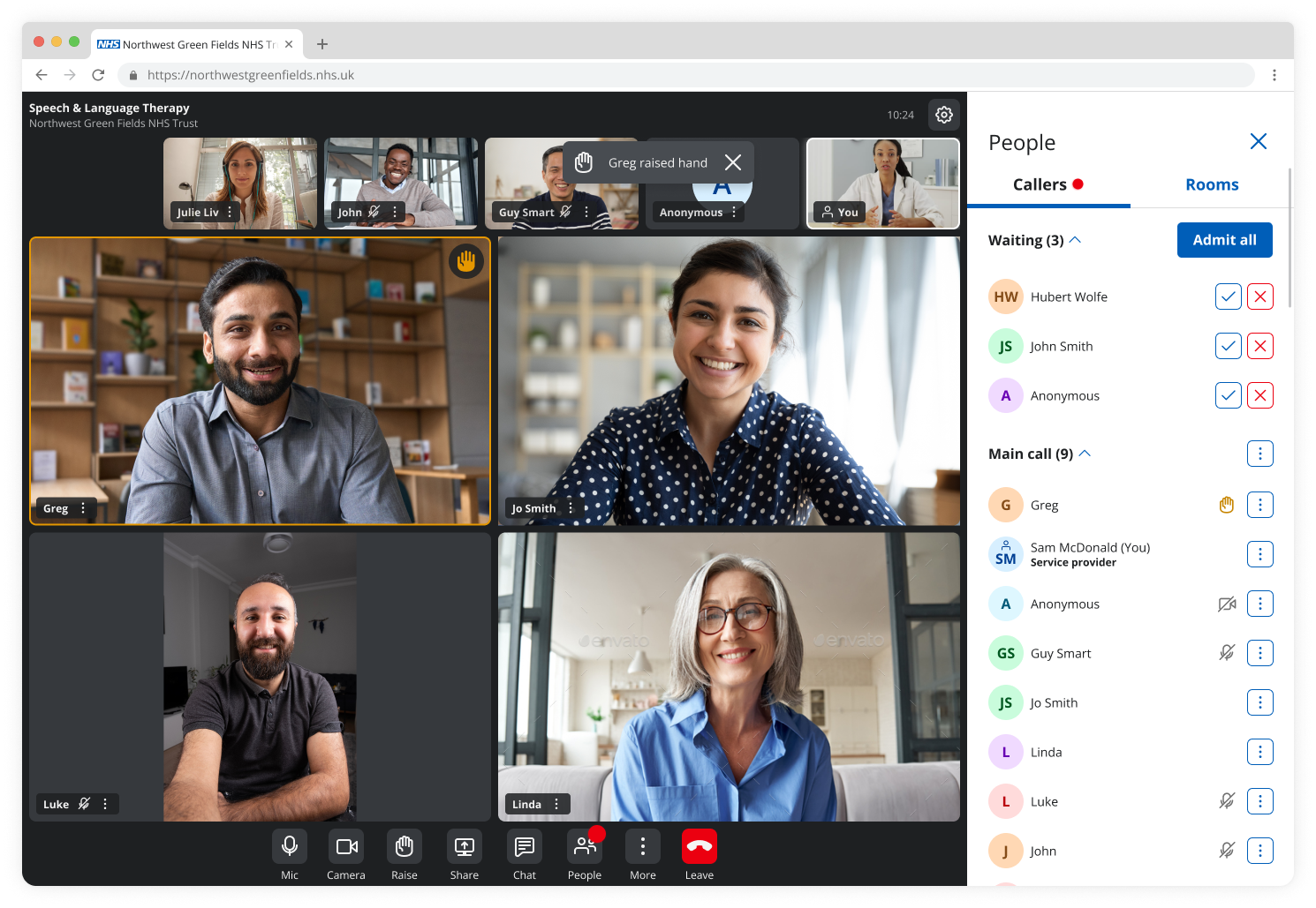
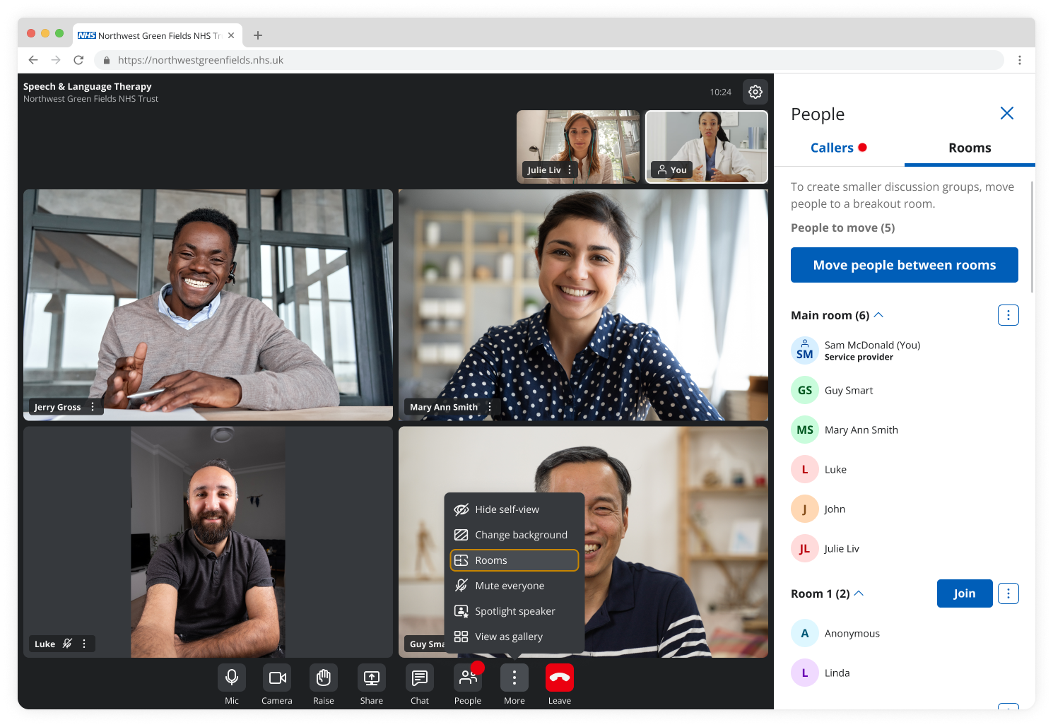
The core journey was streamlined to minimise friction, enabling users to join and manage consultations quickly and confidently.
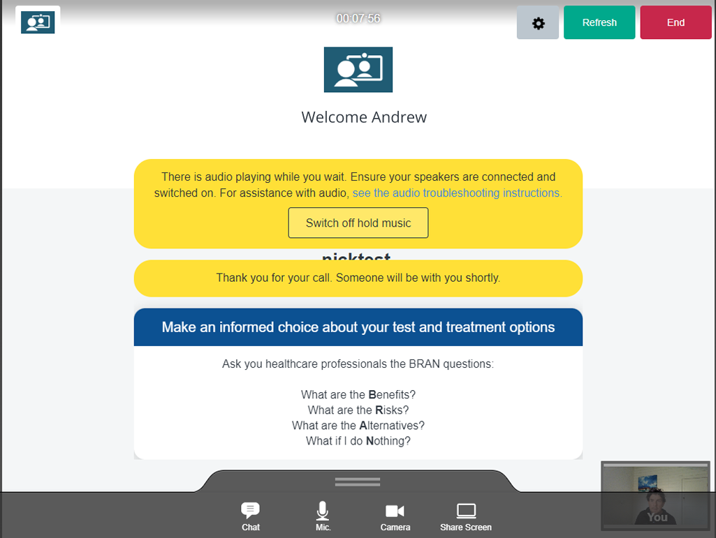
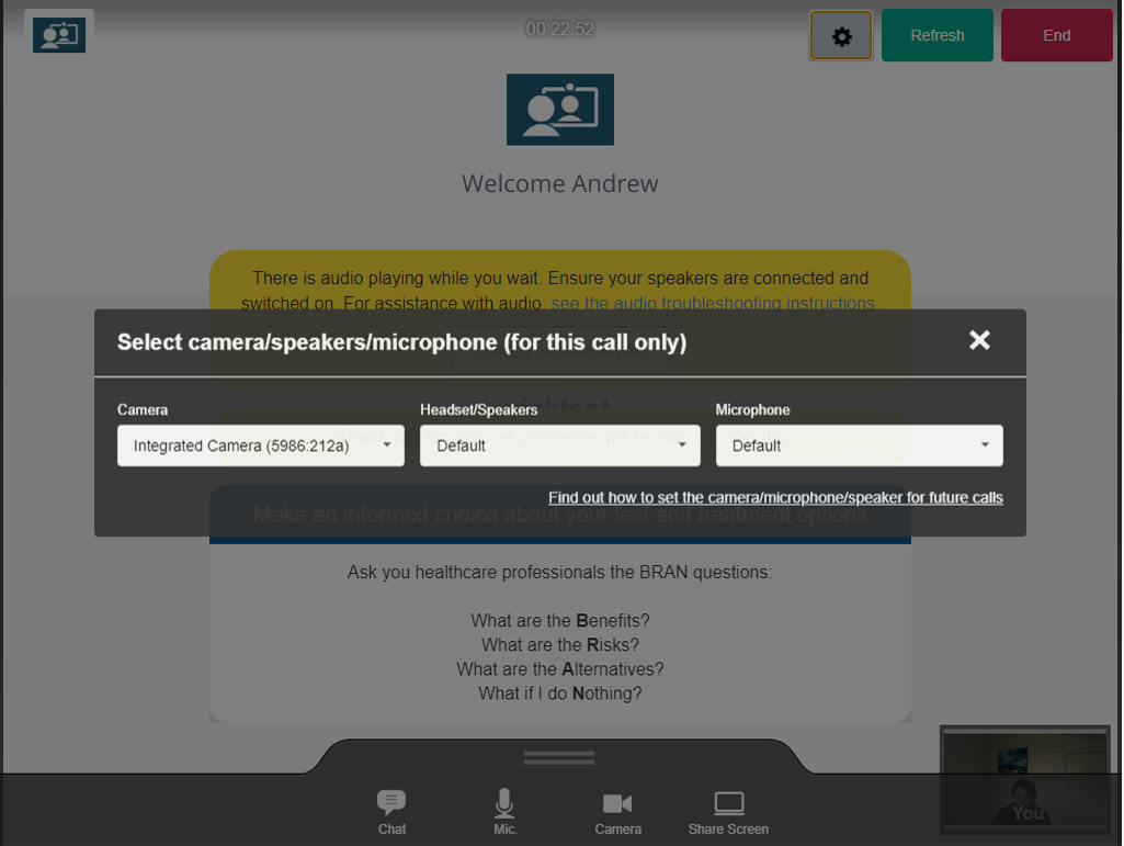
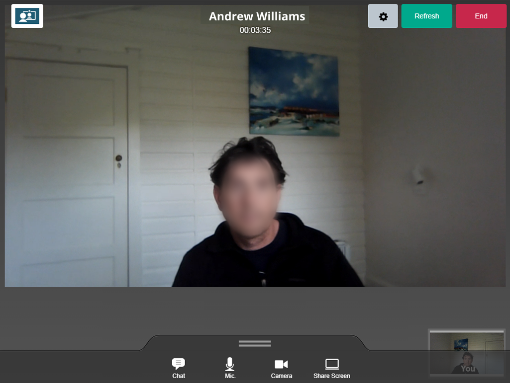
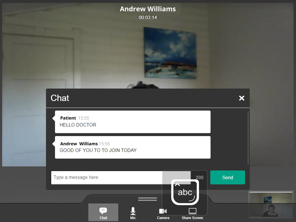
Waiting state: Patient view for regular calls
In-call interface: Patient view for regular calls
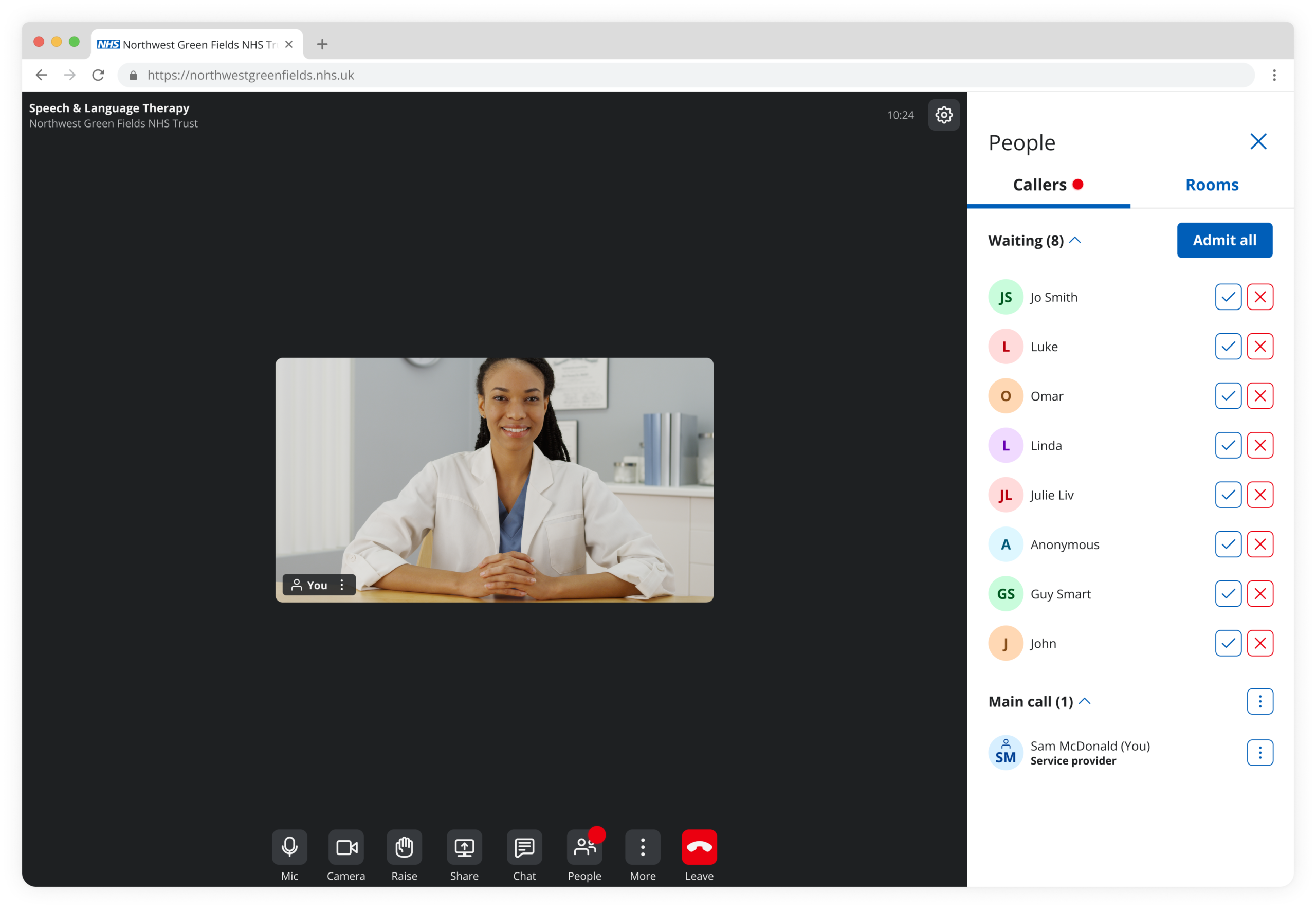
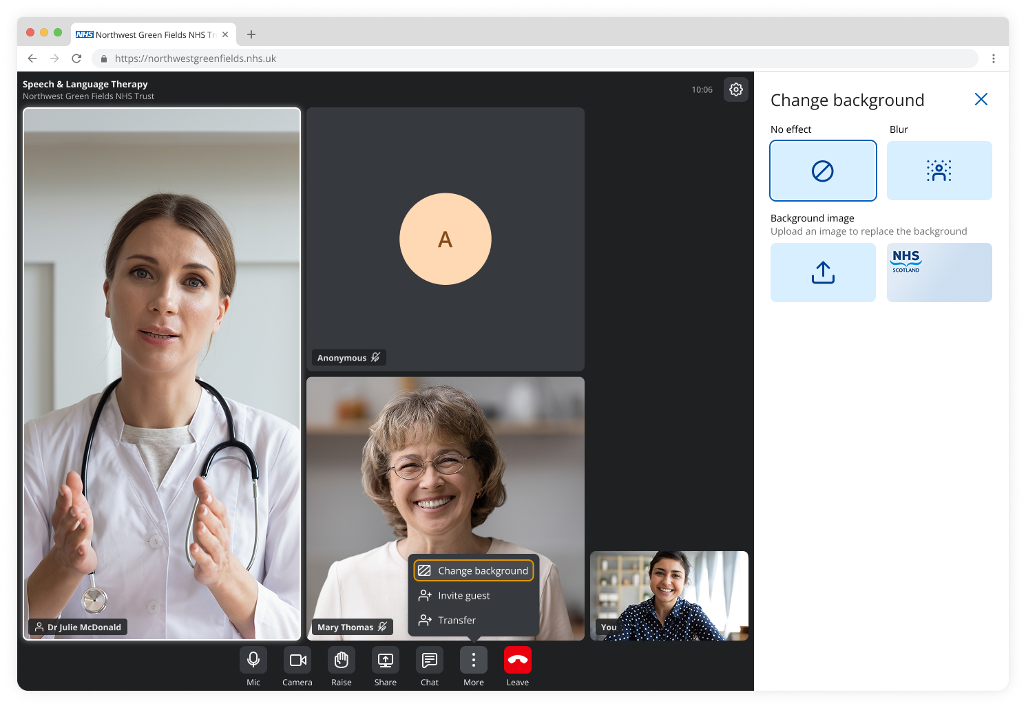
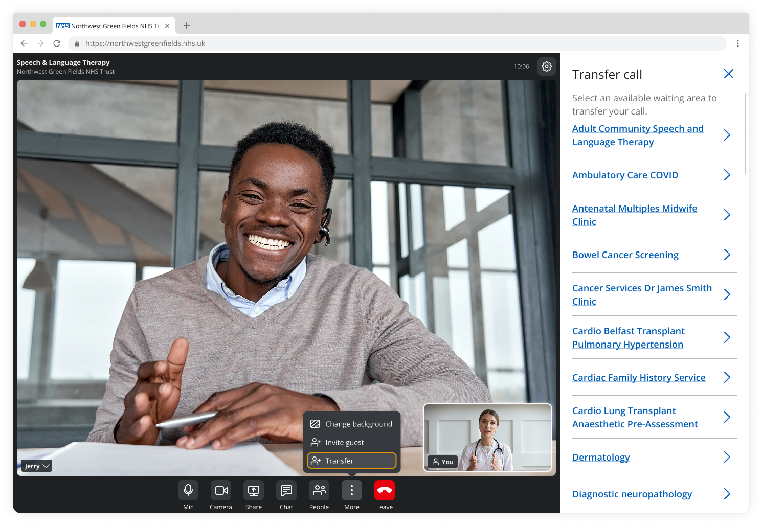
Waiting state: Healthcare provider view for group consultations
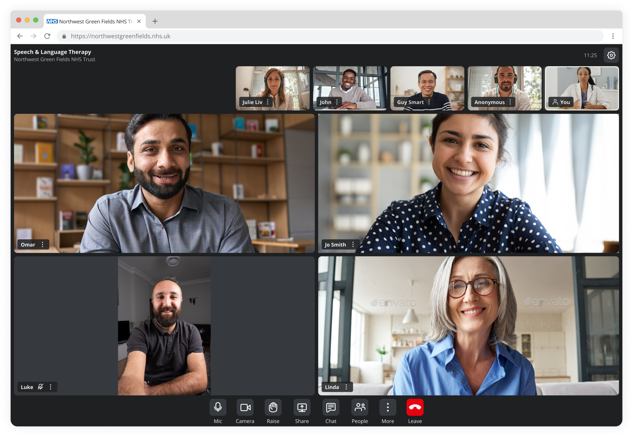
In-call interface: Healthcare provider view for group consultations
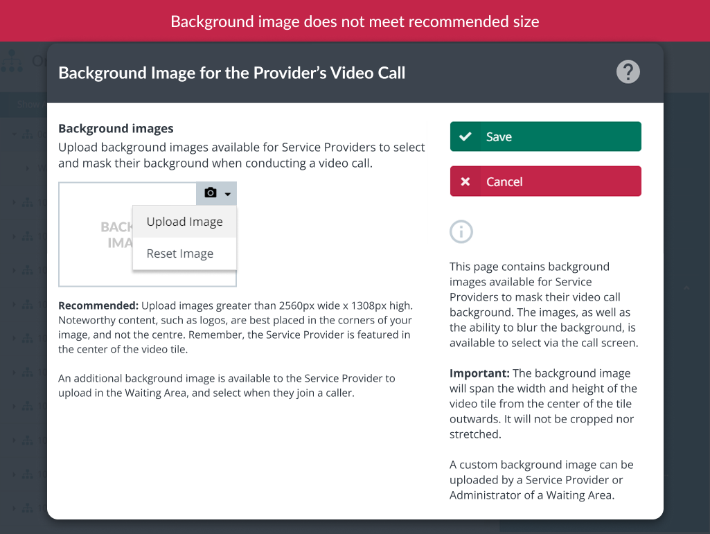
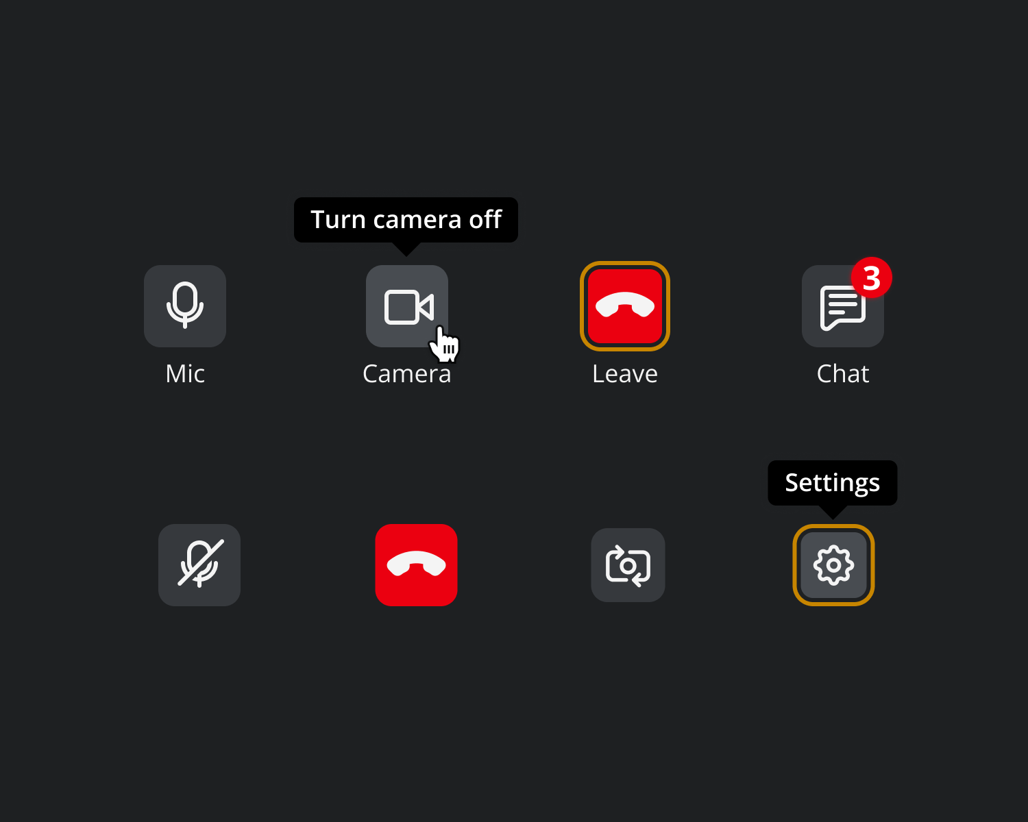
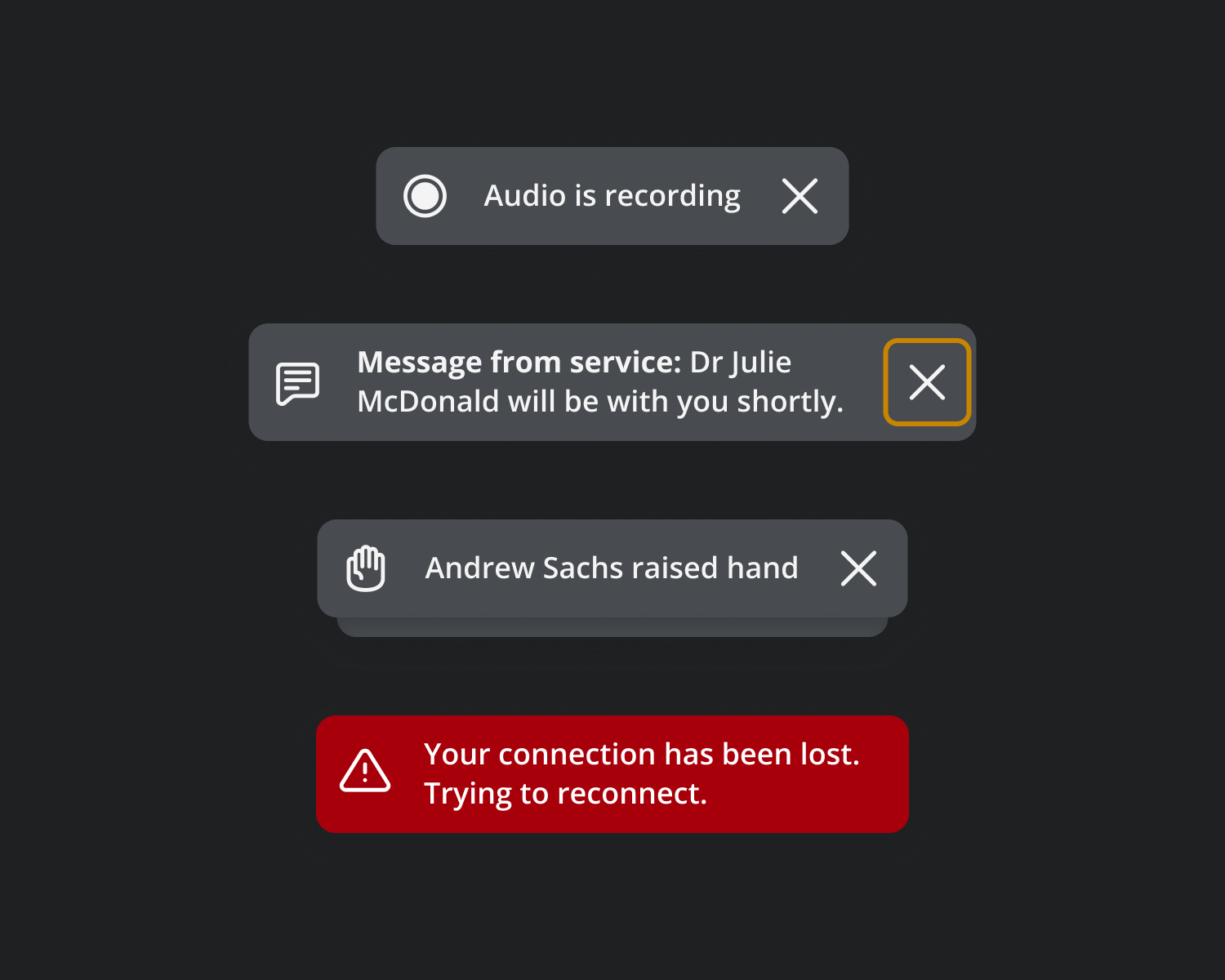
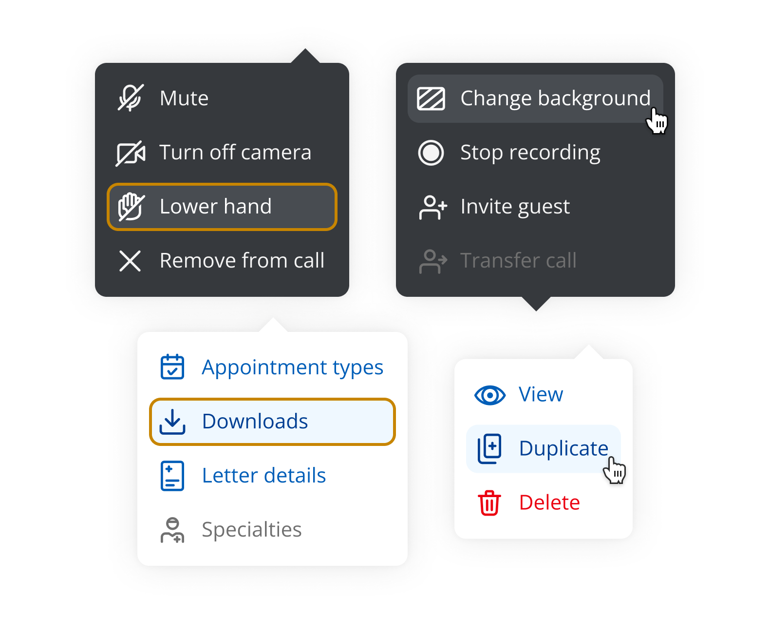
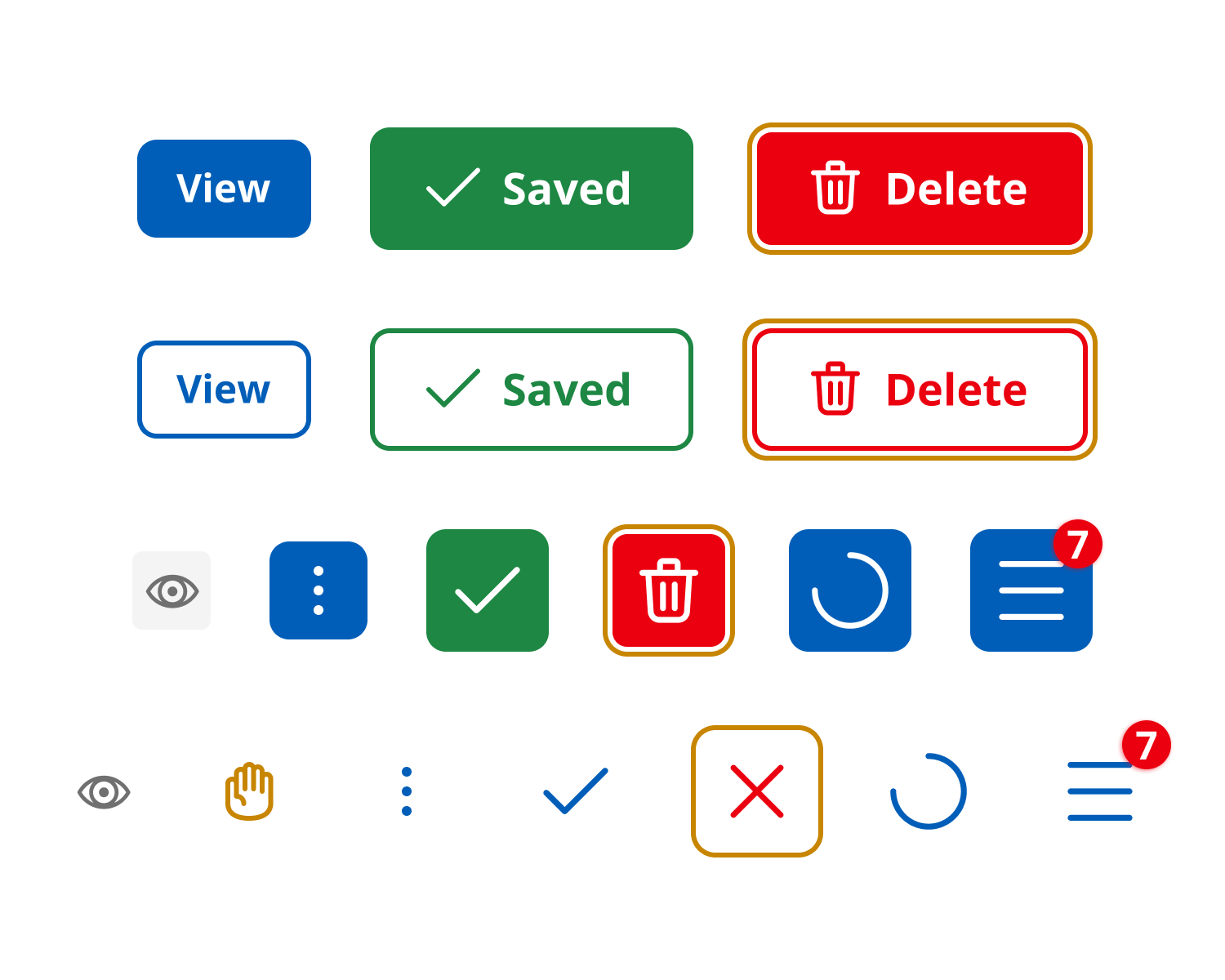
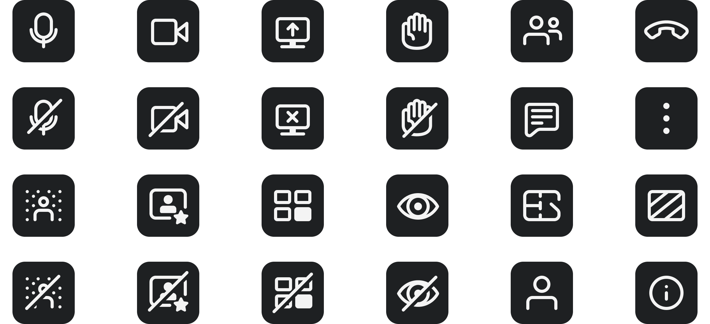
UI elements
Interaction patterns were standardised to provide clear, consistent feedback and reduce user uncertainty.
Also, reusable components from the Design System ensured consistency, scalability, and accessibility across the product.
Results and impact
The platform became easier to use, more reliable, and more inclusive for all users. The redesigned experience led to measurable improvements:
• Drove higher client retention and increased new business conversion by elevating the overall product experience
• Re-architected the platform with a modern, scalable backend, significantly reducing ongoing operational costs
• Enhanced video performance with measurable gains in call quality, reliability, and resilience
• Delivered a universally accessible interface tailored to the needs and constraints of healthcare environments
• Designed a flexible, dynamic layout framework to support diverse consultation scenarios
• Simplified user interactions by refining controls and reducing on-screen complexity
• Strengthened privacy and compliance through granular, user-configurable settings across core features
⥣
increase in successfull call joins
⥥
reduction in time to join consultations
⥥
reduction in tickets related to usability issues
Client feedback

My feedback is so positive – it’s incredibly straightforward to use and the interface is great – like Zoom but feels much more secure and straightforward.
The clients I have spoken to liked using Zoom but hate using Teams, so they feel that this is a far better option than having to move to Teams meetings.
I love the new modern look and feel of the new call screen. It was great how smooth the update went.
Me and my patients think it looks great and slick.
Usage scenarios
As a result, the project provided comprehensive end-to-end functionality, covering essential capabilities users expect from leading video conferencing tools, along with specialised workflows for healthcare and public sector needs.
Also, it delivered new Ul components tailored for video consultation and seamlessly integrated them into the global Design System, ensuring consistency, accessibility, and scalability.
Promo video
Next steps
To continue improving the experience, future work includes:
• Introducing microinteractions to enhance feedback and usability
• Expanding “nice-to-have” features to enrich the experience
• Further improving accessibility beyond compliance (e.g. AAA considerations)
• Strengthening the design system for scalability and accessibility consistency
• Continuing close collaboration with developers during delivery
Reflection
This project reinforced the importance of designing for inclusivity as a core principle, not just a requirement and balancing ideal design solutions with real-world constraints. If I were to approach this again, I would:
• Introduce earlier accessibility validation and testing with users
• Strengthen alignment during development to reduce rework
• Advocate for more time to refine interaction and accessibility details